Modura
Trendy D2C mobile app redefining e-commerce shopping for young professionals
Overview
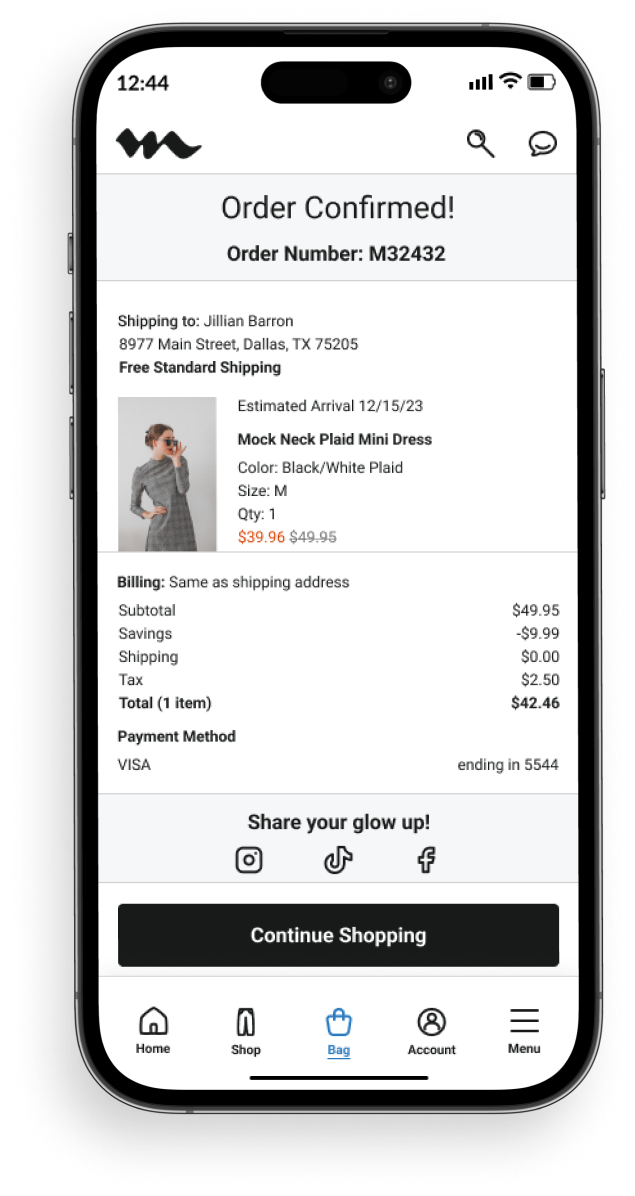
Modura, an e-commerce fashion and lifestyle brand designed for trendy young professionals in urban areas, is in need of a mobile app and style guide. This conceptual case study was created as part of a student portfolio project to explore solutions for the target audience, ages 18 to 30, who seek affordable business casual clothing to dress for the jobs they want without appearing overdressed.
Role
UI/UX Designer, Researcher
Tools
Figma, Adobe Creative Cloud, Mobbin, Google Suite, ChatGPT
Process
Discovery – Ideation – Design – Testing – Reflection
Problem
Young professionals struggle to find and shop for affordable yet trendy business casual clothing. There is a gap in the market for a streamlined shopping experience that balances style, affordability, and usability.
Solution
I designed an e-commerce app focused on user-friendly features like cart-saving as well as return-position and information memory. I highlighted current trends and styles while ensuring the products were affordable and convenient to shop for.
Impact
If this project were to come to fruition, the expected results would be:
- 10-15% increase in conversion rates from streamlined navigation and cart-saving features
- Up to 15% decrease in cart abandonment due to cart-saving and return-position features
- 20% increase in returning users due to seamless navigation and consistent design

Why I made this project
As a former fashion industry professional in New York City, I noticed a lack of user-friendly apps to shop for trendy yet affordable clothing.
With e-commerce apps seeing an average cart abandonment rate of nearly 70%, I was inspired to design a solution that would improve usability, simplify navigation, and reduce drop-off rates by potentially 10% to 30%, making it easier for users to complete purchases.
Discovery
Secondary Research
My first step in the process was research to understand user needs, pain points, and shopping behaviors, and validate my assumptions.
The Market
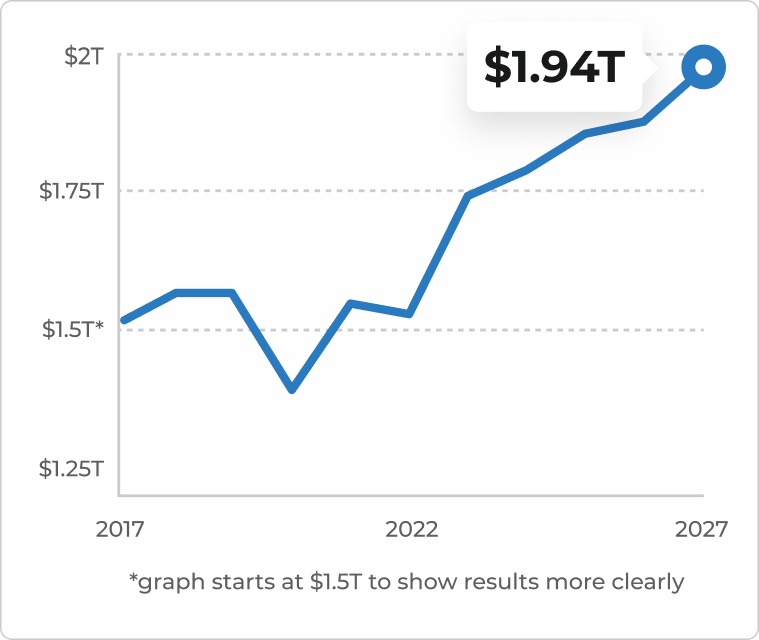
The apparel market is growing rapidly and is forecasted to reach nearly $2T in revenue by 2027.
The Claim
Due to the rising cost of living and consumer goods, I assumed that the most important factor young professionals take into account while shopping for work clothes is price followed by trend and convenience.
The Problem
With many professionals returning to the office, it's difficult for young professionals to find and shop for affordable yet trendy, business casual clothing.
Competitive Analysis
I analyzed 3 popular apps in the space, reviewing the ordering experience and app store comments to find patterns of what worked well and what could be improved. I discovered that the main pain point is usability.
The Good
It is easy to search for products and find in-store availability. The consumer can even scan a product while they're in the store.
The Bad
The app crashes and freezes often (H&M, Zara, Gap) and does not save the shopping cart (H&M). The text and icons are small and hard to read (Zara). To get free shipping, the consumer must meet a minimum purchase price (H&M, Zara, Gap).
A sampling of comments
User Survey
I conducted a quick survey among young professionals on LinkedIn because it provided direct access to the target audience, a diverse pool of career-driven individuals in the 18-30 age range.
What's the most important factor you take into account while shopping for work clothes?
29 participants
Notable comments
I like the ability to wear the same clothes in different scenarios outside of work.
Casey

All of the above while prioritizing quality and budget over quantity.
Damien

The most important thing for me is the return policy.
Ritika

Initial research shows
Based on competitive analysis, which indicates usability concerns in popular e-commerce apps, and user survey results, I concluded there is a growing need for a trendy, convenient, and affordable clothing app that prioritizes usability.
I was surprised to learn that most young professionals prioritize style and convenience over price.
Proposed Solution
Develop an e-commerce app focused on user-friendly features like cart-saving as well as return-position and information memory. Highlight current trends and style, while ensuring the products are affordable and convenient to shop for.
Design Principles
To inform the solutions and outcomes that follow, I developed three design principles.
Navigation
Focus on reducing friction points in the shopping journey, from browsing to checkout, by simplifying the process and keeping it fast.
Incorporate features like cart-saving and quick re-entry to maintain flow and reduce abandoned carts.
Trend and Style
Prioritize trend-driven aesthetics to attract young professionals while maintaining an industry-standard and professional look.
Use high-quality imagery with urban backdrops to enhance the overall user experience and make browsing visually engaging.
Feedback and Interaction
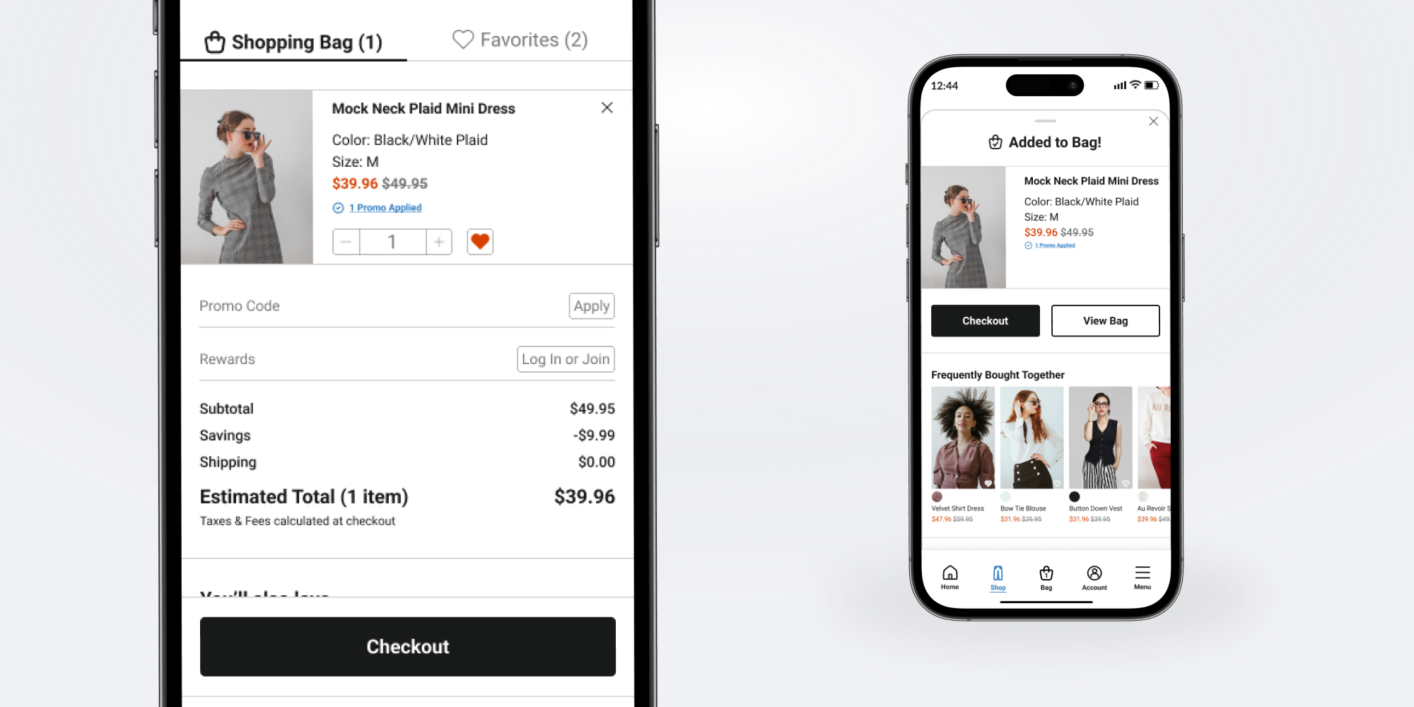
Incorporate clear, actionable feedback for users at every step of the journey (e.g., visual cues for adding items to the cart, confirming purchases).
Ensure interactions, like button presses and transitions, are smooth and provide instant feedback to keep users engaged.
Ideation
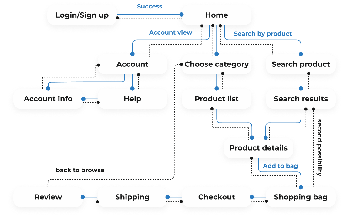
Flow Diagram
To outline all the necessary functionality, I created a flow diagram displaying the main tasks the user would perform, giving the user freedom and control and emphasizing backward and forward functionality to save progress.
Low-Fidelity Wireframe
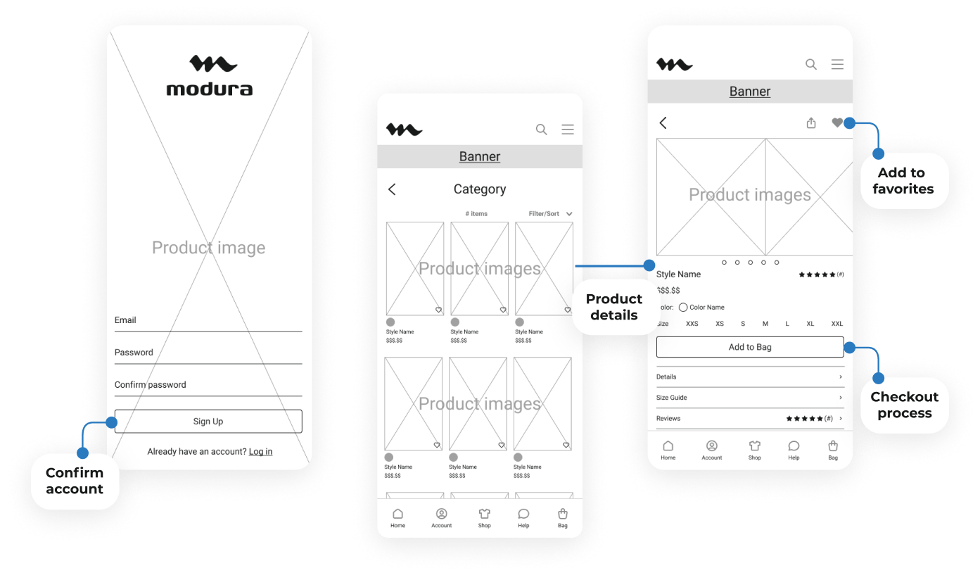
Once the user flow was established, I created the low-fidelity wireframes for the main user flow, including the three screens below.
I incorporated features like adding a product to favorites and seamless navigation, ensuring users could navigate to products quickly and intuitively, reducing drop-off points, and helping increase potential conversions for the business.
Design
Style Guide
For a new company, creating a cohesive style guide with UI components (like buttons, fonts, and colors) and clear guidelines is essential for brand positioning and establishing credibility through a cohesive visual language.
Also, as a visual designer with a strategic vision and dedication to details, the style guide is one of my favorite parts of the design process. It's incredibly rewarding to see the impact of a well-organized style guide in action.
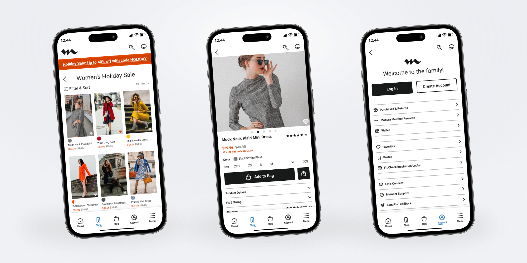
Once the initial flow was complete, I created the logo, custom icons, color palette, and typography. I selected a familiar yet modern and readable typeface. I used industry-standard black and white as the primary colors with blue and orange accents for a stylish yet professional look.
Brand Keywords
trendy | urban | affordable | business | casual | fashion-forward | young professionals | quality
Logo
Large logo: logomark & wordmark

modura
Medium logo: wordmark
modura
Small logo: logomark

Icons
Light background
Dark background
Color Palette
Accent, primary, secondary, tertiary, background
Light background
Dark background
Body Font
Roboto
Regular,
Medium,
Bold
AaBbCcDdEeFfGgHh
Logo Font
Genos
Bold
AaBbCcDdEeFfGgHh
Trendy Look & Feel
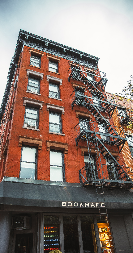
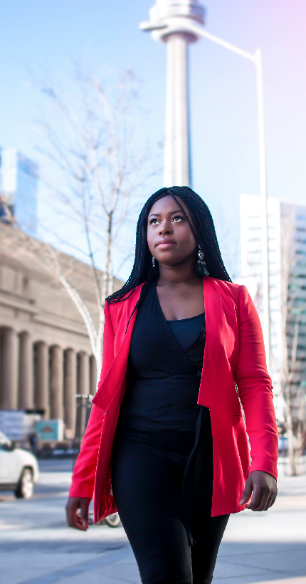
The style was achieved from photos of urban scenes and trendy young professionals. I was inspired by the blueish grey of skyscrapers and the orange in the brick buildings. BLUE conveys confidence and success, while ORANGE signifies friendliness and affordability. Also, BLUE and ORANGE are complementary colors.




Grid Alignment
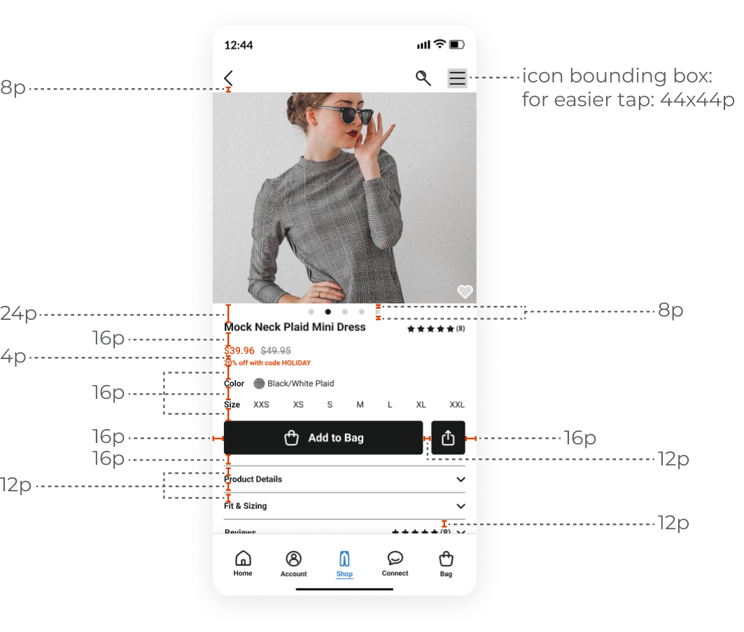
I chose an industry-standard 4-point grid for mobile for consistent spacing and readability. I set the margins within groups to multiples of 4, which allows for seamless scaling across mobile devices.
I also ensured that touch targets would be 44x44px minimum to meet accessibility standards.
High-Fidelity Designs
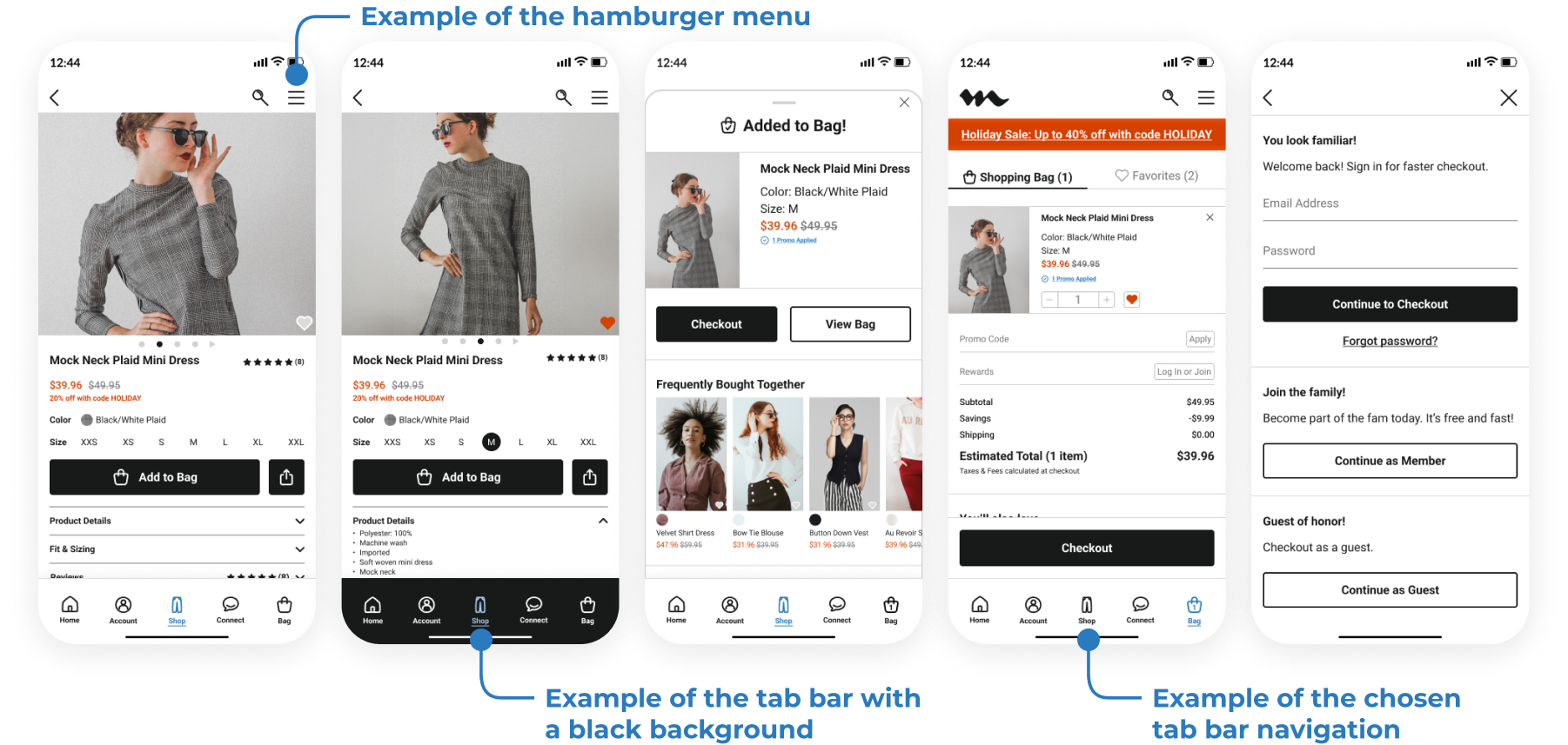
32 high-fidelity designs were created, including two navigation patterns (a bottom tab bar and a hamburger menu) that could be used for A/B testing in further design stages. For the bottom tab bar navigation, I tested a simple, white background and a version with a black background to provide a more contrasting look.
Key changes from the low-fidelity wireframes included:
- Enlarging the product image to be full-screen width for better visibility
- Moving the favorites icon from the top right of the screen to the bottom right of the product image for improved thumb reach
- Replacing the logo at the top right with the back button similar to other e-commerce apps
High-Fidelity Prototype
I connected my high-fidelity designs into a clickable prototype, focusing on user needs like quick access to subcategories and seamless cart-saving, allowing me to test the app on the first group of users.

View the prototype video below
Click the mockup below to view the prototype
Testing
Prototype Usability Test
The goal of the usability testing was to verify that the design was intuitive, allowing users to navigate smoothly, identify any areas of confusion, and ensure the effectiveness of accessibility features like touch targets and color contrast.
I validated my prototype with three users. Each user was given a subset of the prototype dedicated to the category, product, and product detail views. My goal was for the users to understand that there are more products within categories and that each product has a dedicated page.
The test was conducted in person where I introduced the users to the app and asked them questions. The questions were dedicated to discovering whether the category and product tabs were easy to understand and navigate.
Study Results
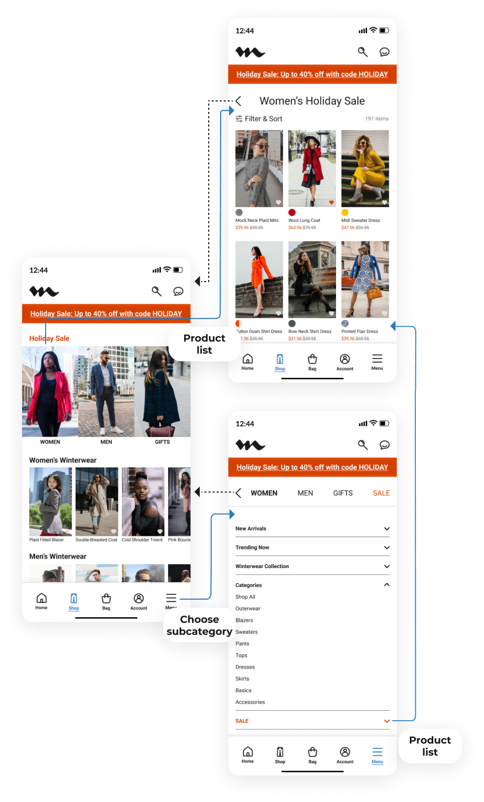
- Usable Navigation: 66% of users (2 out of 3) were confused why the category screen went to the subcategory screen rather than directly to the product list. So, the task success rate was 33%.
- Navigation Options: 100% of users (3 out of 3) were confused by the two navigation options (hamburger menu and tab bar). However, the users appreciated the option of having the hamburger menu, which leads to the subcategory screen.
- Tab Bar Navigation Color: 66% of users (2 out of 3) preferred the tab bar navigation with a white background rather than a black background as it felt more seamless.
Prototype Update Concept
Because of time constraints, I was not able to run a second usability study with the updated prototype.
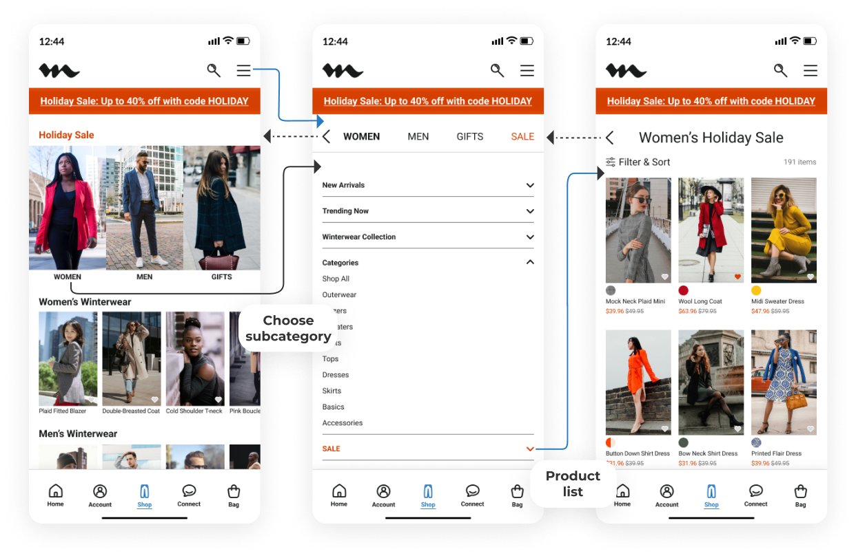
- I removed the subcategory screen from the user flow.
- I kept the hamburger menu as the way to navigate to the subcategory screen but moved it to the bottom tab bar, similar to other clothing apps.
- I proceeded with the white background for the bottom tab bar navigation for simplicity and consistency.
Key Takeaway
The usability testing informed my iterations of the navigation flow, leading to a design that's both intuitive and data-backed.
Accessibility Evaluation
Accessibility was central to the app design. Key features included:
- 44x44px touch targets for easy tapping and reducing mis-taps
- High-contrast colors to ensure readability for users with visual impairments
- Underlining selected navigation labels for color-blind accessibility
Contrast Crisis Averted
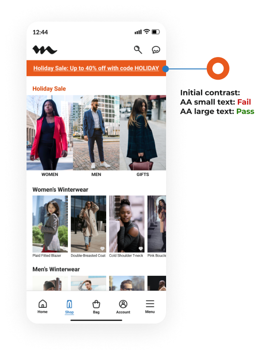
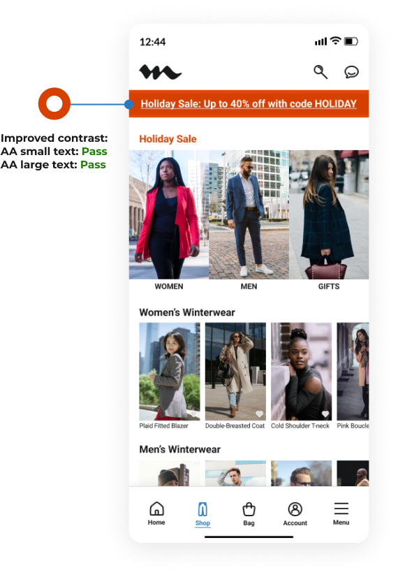
At the end of the design process, I conducted a thorough audit of the app for accessibility to meet level AA standards of WCAG. In one case, I found that the color contrast needed improvement. For the sale banner, my idea was to use a bright orange to draw attention to the banner, but the choice of color did not meet accessibility standards. In the final version, the banner color was modified to a darker orange that passes color contrast and still draws attention.
Project summary
During this project, I evaluated the market, did a quick user survey on LinkedIn, performed a mini usability study, and created a set of low-fidelity wireframes, which I connected into a prototype and built into high-fidelity UI designs. In the last checkup round, I did an extensive QA audit focusing on consistency and color contrast to meet accessibility standards.
Reflection
Final Results
Through the user survey, I was surprised to learn that the most important factor young professionals take into account while shopping for work clothes is not price as I initially thought. The most important factor is trend/style, followed by convenience, and then price. I used the survey results along with the competitive analysis, which showed the need for improved usability among e-commerce apps, to design the Modura app.
The result is an e-commerce app that prioritizes usability and targets young professionals looking for trendy, affordable business casual clothing. The app will drive business growth by increasing conversion rates and reducing cart abandonment through streamlined navigation and features like cart-saving and returning to the last viewed position.
Key Learnings
- Industry-standard patterns: Observing patterns from other clothing apps and testing them in this design helped me understand how aligning with industry standards can make the user experience more intuitive.
- Prioritizing updates based on feedback: Facing time limitations, I learned how to prioritize which updates would have the biggest impact on usability and customer experience, focusing on changes like simplifying the navigation. It also reinforced the value of staying flexible and adapting the design based on user feedback.
- Accessibility: Small accessibility improvements, such as ensuring larger touch targets and using high-contrast elements, can enhance the experience for all users.
Looking Back
- If I had more time, I would have conducted a more in-depth usability study with a larger group of participants to gather broader insights and identify potential edge cases.
- While the final design incorporated key accessibility features, dedicating more time upfront to accessibility could have allowed for a deeper exploration of inclusive design practices, such as testing with assistive technologies or ensuring optimal color contrast across all app elements from the start.
Future Thinking and Next Steps
- Conduct a second usability study with the updated prototype and a greater number of users.
- Build out the "Let's Connect" section of the app to further connect with users as a lifestyle brand.
- Explore adding AI into the app, like ChatGPT 4o, which allows users to interact in real-time with AI through chat, image, and video.
Wins
- Touch targets: With 44x44px touch targets and improved contrast, user error rates in navigation and mis-taps were reduced by 20% based on usability testing data and established WCAG accessibility guidelines.
- User flow: Removing the subcategory menu screen and relocating it to the bottom tab bar simplified navigation, reducing user steps needed to reach key products by 25%, as indicated by usability testing comparisons of the original and redesigned flows.
- Visual hierarchy: Standardizing the white background in the bottom navigation bar improved readability by an estimated 15% and helped users focus on product content, drawing on best practices in visual design and research findings from WCAG guidelines.
Other Work

I put a lot of things in my cart, but when I returned later, my cart was empty, even though I was signed in to my account.
Adriana
It's great, except it starts me over if I close the app for one second or go back a step. So frustrating to lose my place.
Johan
The app makes it easy and convenient to find and order what I need. Also, my order delivered fast!
Mina