Daisy
D2C generative AI web platform that simplifies prompting and engine selection for content creators
Overview
Daisy is an AI web platform built by CreatorUp, an innovator in content creation, that simplifies prompt engineering and engine selection by leveraging multiple engines. While Daisy already had an existing platform, the goal was to establish an intuitive visual structure and design guide to enhance usability and consistency. The improvements aimed to streamline the user experience and reinforce CreatorUp's mission to empower storytellers through innovative and accessible technology.
My Role
Product Designer
Tools
Figma, Slack, Monday.com, ChatGPT, CopyAI, Google Suite
Process
Discovery – Sprint 1 – Sprint 2 – Delivery – Reflection
Problem
The existing platform was intimidating and confusing, which conflicted with Daisy's mission to provide a powerful yet easy-to-use platform for quick content creation. Users struggled with a lack of clear navigation, intuitive functionality, and accessibility, leading to frustration and high drop-off rates. A more intuitive and cohesive design was essential to improve the user experience, increase customer retention, and drive sales growth.
Solution
Our team redesigned the platform, delivering consistent home, dashboard, content, and pipeline pages with clear navigation and an optimized, accessible design. These improvements allow users to create quickly and reduce confusion. The elevated design better aligns with Daisy's mission and is projected to enhance user engagement, retention, and sales growth by enabling an efficient, enjoyable content creation experience, fulfilling the client's goals.
Impact
- I redesigned the homepage with light and dark mode options, visual hierarchy, and interactivity, enhancing accessibility and navigation efficiency by an estimated 30%.
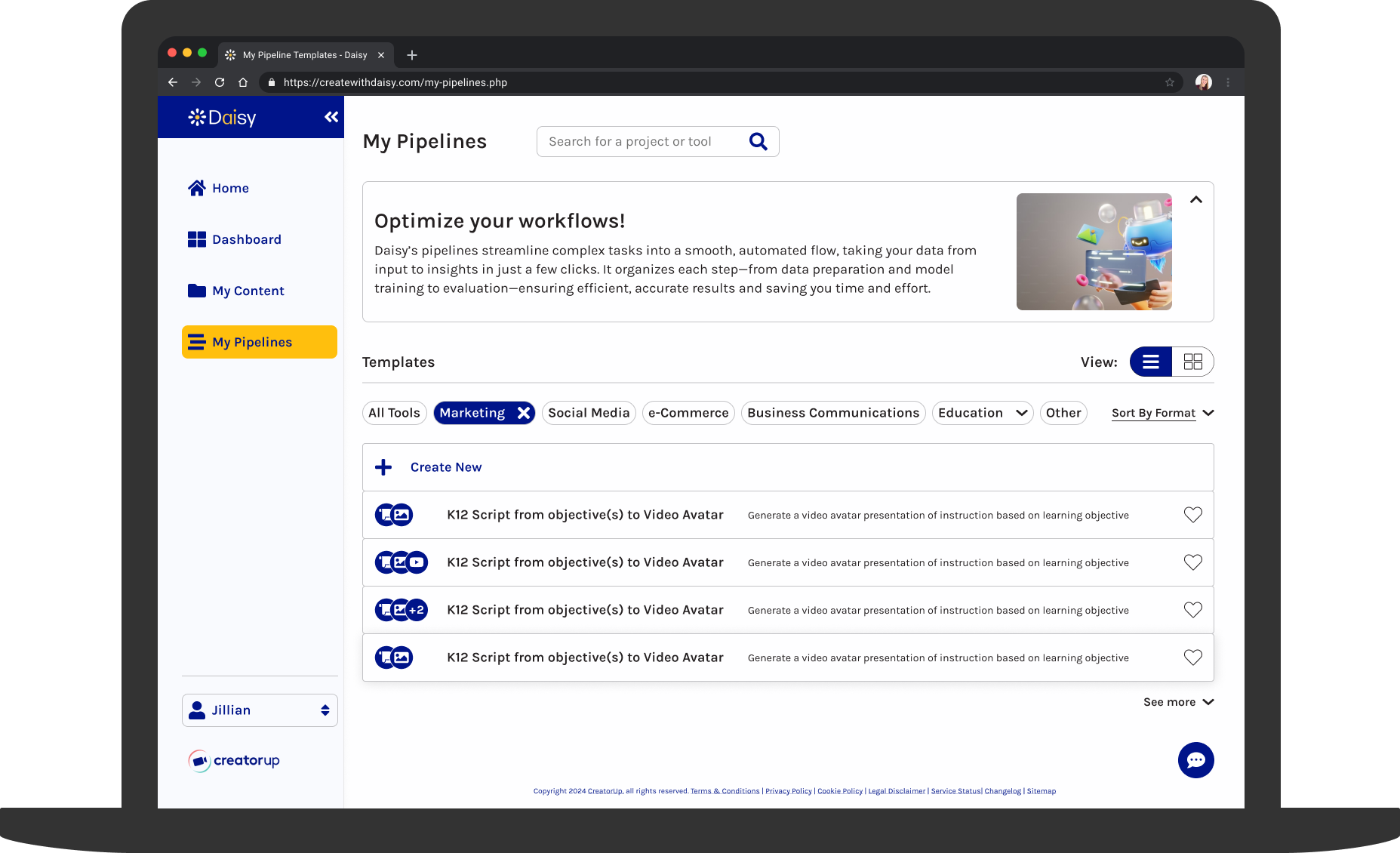
- By introducing customizable card and list views, contextual help, and filtering and sorting options, I elevated the My Pipelines page, improving clarity, user control, and workflow for 90% of use cases.
- I created a "How-To" section for the My Pipelines page to explain complex tools, which earned positive client feedback and is projected to reduce user confusion by 25% and improve user onboarding by 40%.
Discovery
Kickoff
At the start of the project, my team and I met over Zoom, where we learned that Daisy had prioritized product development and was in need of design expertise to elevate the user experience of their website. We started with an existing product and client intake questionnaire. We were then able to define our process steps and deliverables in the redesign of the four webpages.
Client Takeaways
From the initial client intake questionnaire, I gathered the following takeaways that would guide my design process through 1 to 2-week sprints:
- Daisy defined product success as driving increased usage, enhancing brand awareness, and boosting subscriptions.
- Daisy provided the brand keywords of creative, education-focused, and tailored. The company's offerings included a range of customizable creative services, with a strong focus on education.
- Daisy targeted individuals who seek to create content quickly and easily.
- The Daisy team wanted users to feel the platform is powerful yet easy to use.
Secondary Research
Upon joining the Daisy project, I reviewed the project's goals and documentation in detail to fully understand the company's challenges.
Competitive Analysis
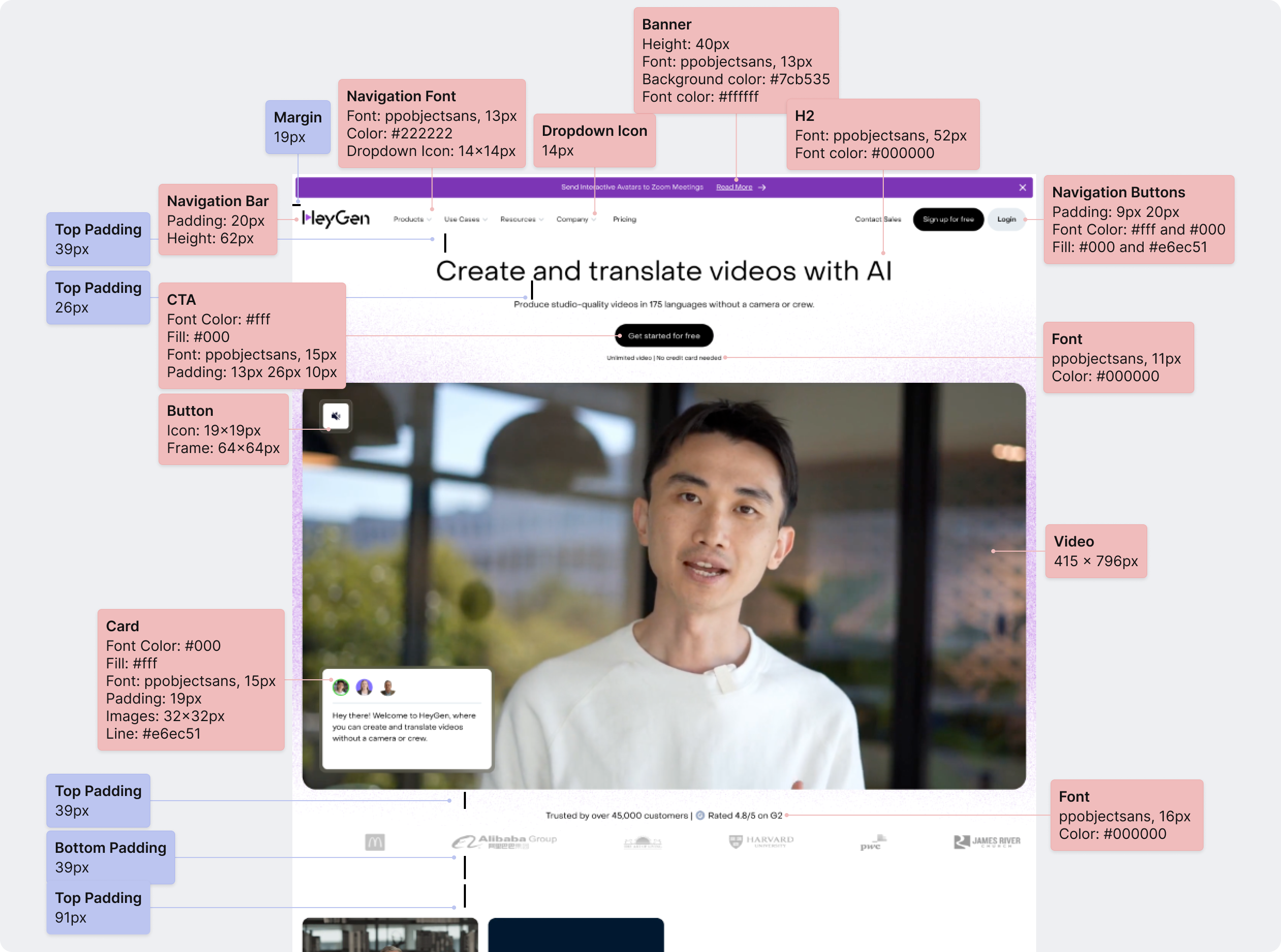
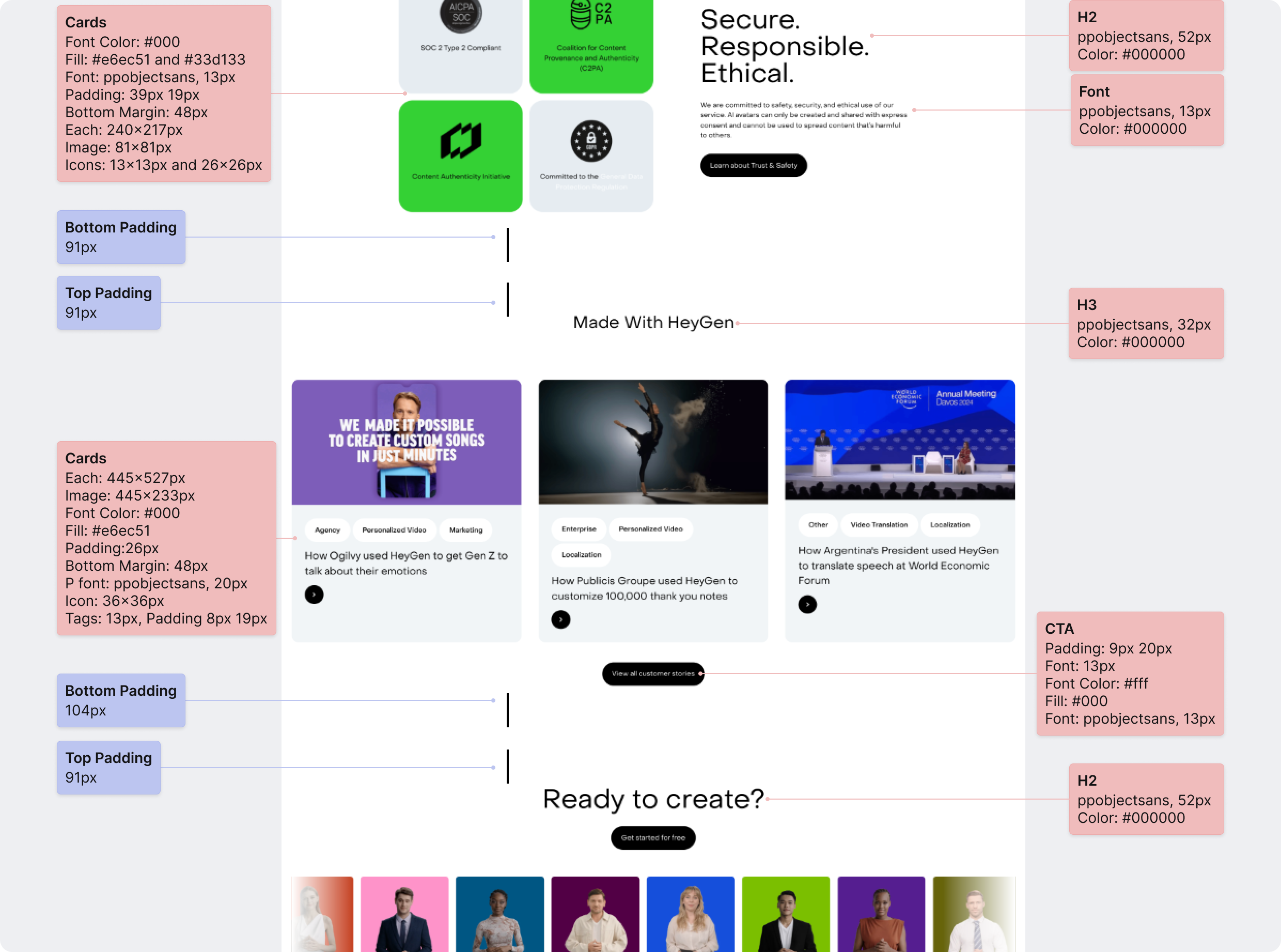
To prepare for the redesign, I conducted a competitive analysis, comparing platforms like copy.ai and HeyGen, to assess accessibility, color, interactivity, and navigation. Some of my takeaways were:
- Visual Consistency: My research reinforced the need for a uniform visual language, influencing the decision to use a 12-column desktop grid for consistent spacing, along with a simple, readable sans-serif font and clear typographic hierarchy.
- Interactivity and Engagement: I discovered that integrating more images and videos, like HeyGen's homepage, could better demonstrate Daisy's capabilities and create a more interactive experience, in contrast to the text and icons on the existing website.
Sprint Context
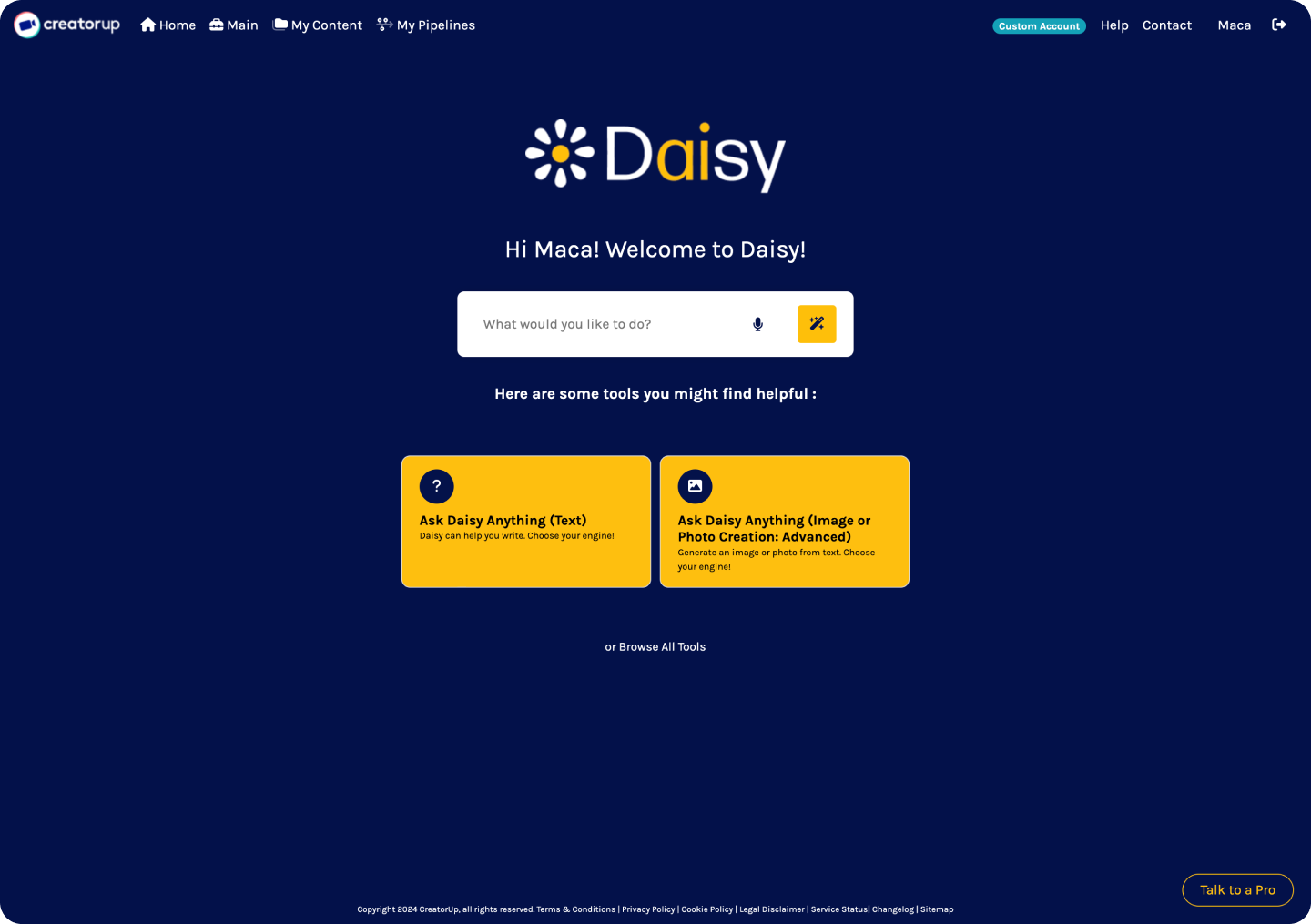
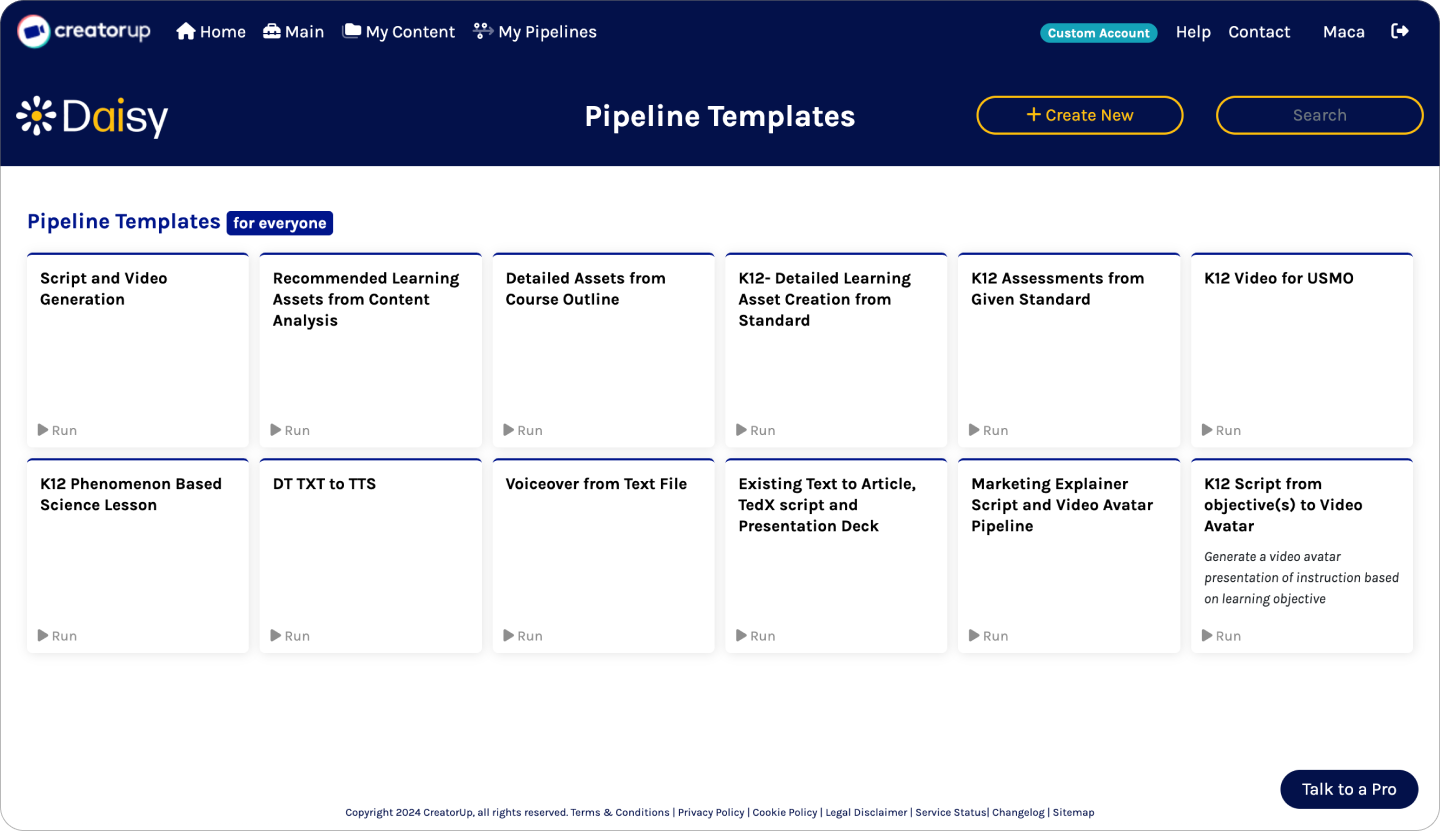
With our scope decided, we divided the redesign of the four webpages into two distinct sprints. Each sprint consisted of Research, Ideation, Design, and Iteration processes. Within each sprint, I had an area of responsibility to limit scope and focus on individual pages of the website.
Sprint 1: Homepage and Dashboard Page (Homepage and Navigation)
Sprint 2: My Content and My Pipelines Pages (My Pipelines Page)
Sprint 1: Homepage
Research
My role was to design a streamlined, tech-forward homepage that aligned with Daisy's mission of providing an efficient, user-friendly content creation platform. This required balancing aesthetics with functionality to ensure the design is engaging and easy to navigate.
Competitive Analysis
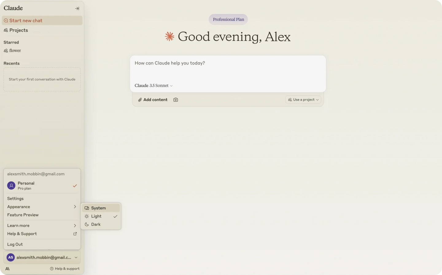
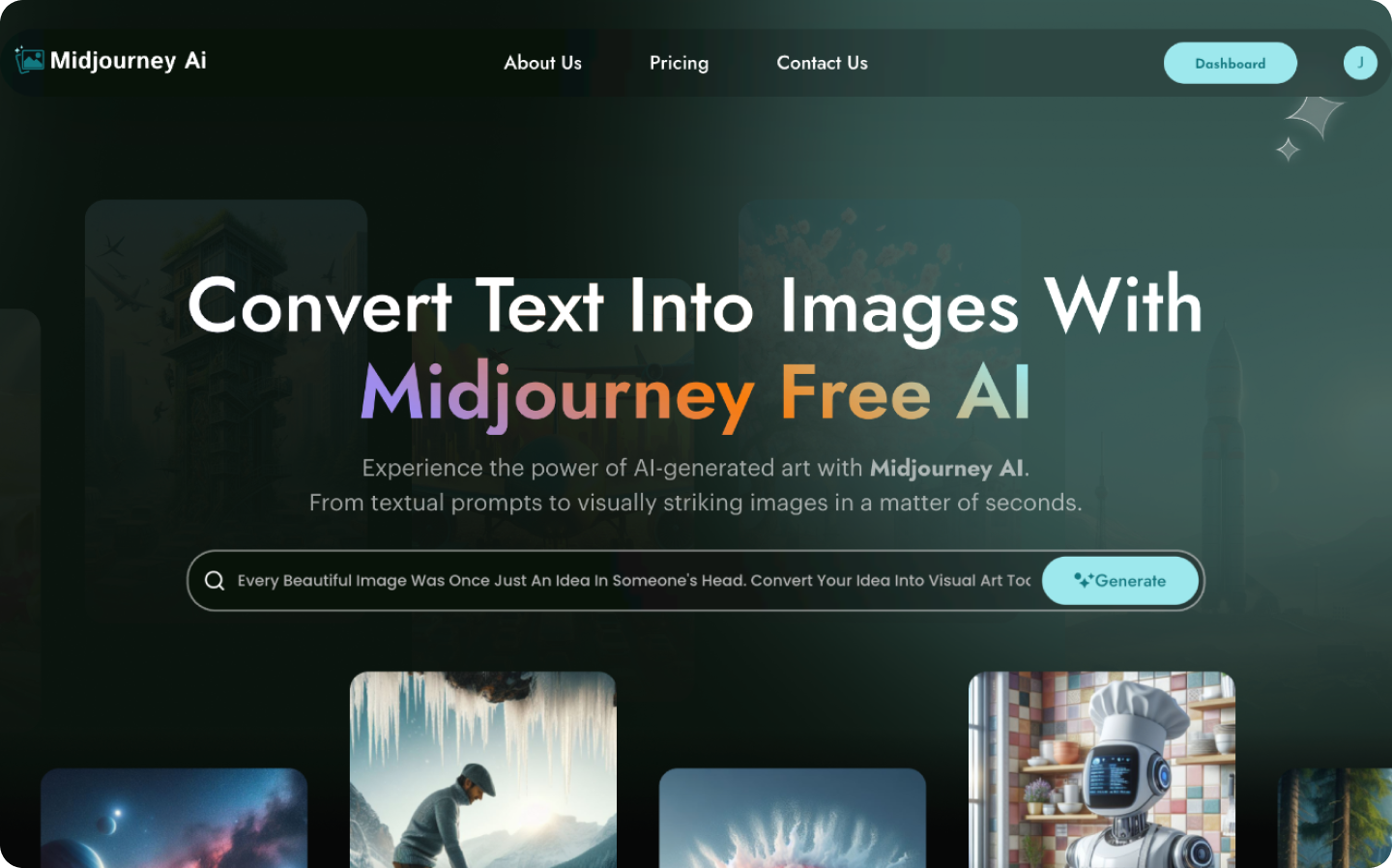
I conducted an extensive competitive analysis on platforms, like copy.ai and HeyGen, and studied tech-forward examples on Mobbin, like Claude and Midjourney. I also analyzed trends in navigation, layout, and visual consistency, identifying design patterns and UI components that would best meet Daisy's needs. Highlights from the findings were:
- Clear Navigation and Hierarchy: Clear navigation and content hierarchy are key to reducing user confusion, leading me to consider restructuring the homepage content by moving the navigation bar from the top of the page to a left sidebar.
- Light and Dark Modes: Popular platforms, like ChatGPT and Claude, showed the growing trend of offering both light and dark modes, which inspired me to incorporate this modern, tech-forward feature into Daisy's platform for a customizable, dynamic user experience.
Existing Product Evaluation
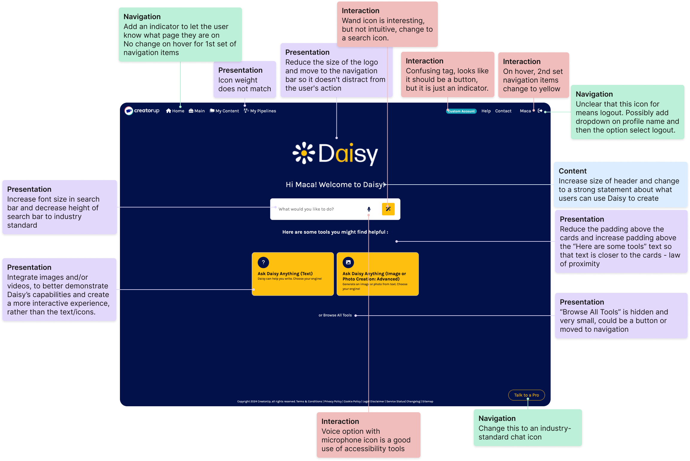
I also conducted an NCPI (Navigation, Content, Presentation, Interaction) evaluation of Daisy's existing homepage. I annotated components and sections that could be improved, such as:
- navigation
- content hierarchy
- visual engagement
I annotated the webpage with my observations, which can be seen in the image below. These observations were then documented in an NCPI table, providing clear insights for actionable recommendations.
Key Takeaways
The insights from my research influenced the next phase of the project, including creating a flexible design system for light and dark modes and establishing consistent navigation across all pages.
Ideation
The challenge for the homepage redesign was to create a usable, cohesive design that addressed the confusing navigation and functionality.
Low-Fidelity Wireframes
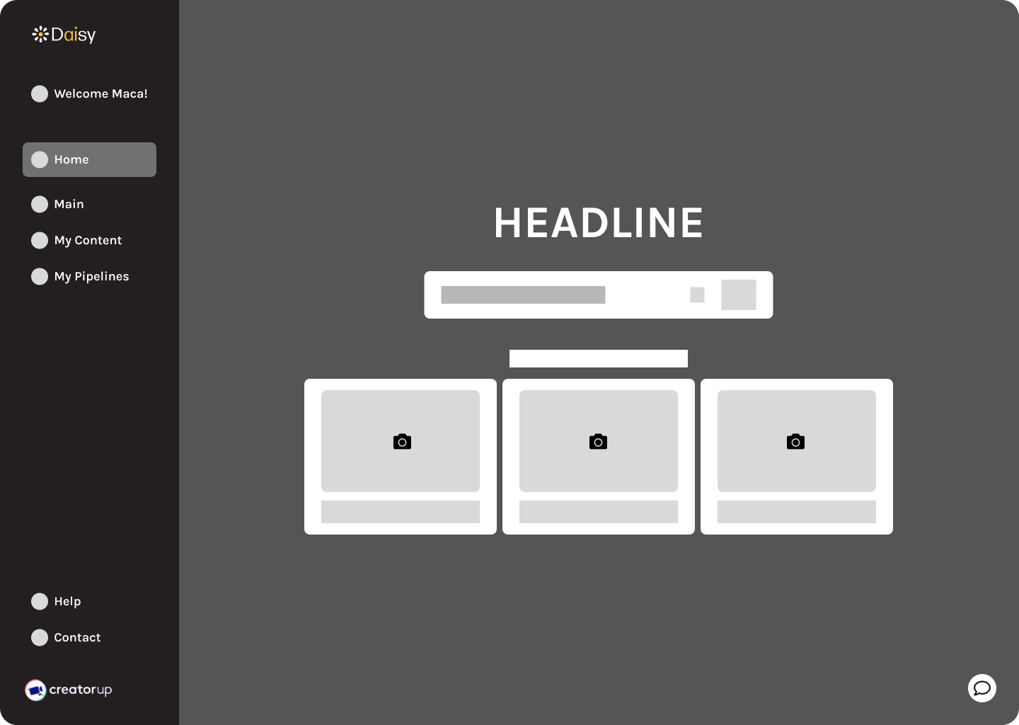
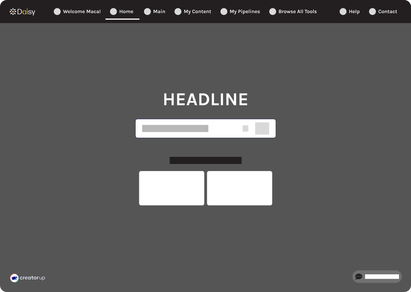
I gathered inspiration from AI platforms, like Perplexity, Leonardo AI, and Claude, and noted features like left-side navigation bars, colorful designs, top left logo placement, and a headline and search field in the hero section. These ideas shaped two low-fidelity prototypes:
- Option 1: Side navigation bar and cards with images and text
- Option 2: Top navigation bar and cards with icons and text
The side navigation bar in Option 1 emerged as the preferred approach due to its alignment with user needs for clear navigation and accessible content. Placing the logo on the top left followed established usability patterns while integrating a headline and search bar in the hero section improved clarity and functionality. Annotations across pages helped refine layouts, such as consistent placement for CTAs, appropriate spacing, and a clear visual hierarchy that emphasized user goals.
Key Takeaways
The ideation phase tackled key user stories by enhancing clarity, reducing confusion, and creating a cohesive visual language. The new layout not only improves navigation but also sets a strong foundation for a consistent user experience across the platform.
High-Fidelity Designs
For the high-fidelity homepage design, I aimed to set a clear foundation for the platform pages by addressing user frustrations with navigation, functionality, and accessibility. The design iterations were informed by team discussions and user pain points.
My main tasks included:
- Navigation Bar: I iterated on various layouts with the labels and logos for clarity and designed a collapsed version of the navigation sidebar for customization while maintaining the tech-forward aesthetic.
- Light/Dark Mode Screens: I tested screen and navigation bar colors and theme toggle placements for seamless integration and a customizable user experience.
- Hero Section: I adjusted elements like the chat icon and logo placement to improve organization and flow. Additionally, I introduced a heading, optional subheading, and promotional banner to help users understand what the platform offers. I replaced the icons in the cards with images and a placeholder video avatar to provide a more visual, descriptive representation of the tools.
Challenge
A major challenge was aligning design elements across screens while the team worked remotely and asynchronously. To overcome this, we collaborated over Slack, Figma, and on calls to ensure alignment and consistency. I maintained clear documentation in Figma and initiated calls to ensure consistency.
By establishing clear guidelines for grids, colors, typography, and spacing, we minimized discrepancies and created a cohesive approach. These decisions were driven by their impact on usability and accessibility and incorporated feedback from the client and senior designer. For example, the collapsible navigation improves user flow, and the light/dark mode theme toggle adds a modern, customizable feature.
Key Takeaways
The iterations not only improved the homepage but also established a consistent design framework for the platform. By refining the navigation structure, visual hierarchy, and interactive elements, the redesigned homepage directly addresses user frustrations and maintains alignment with Daisy's mission to empower content creators through innovative and accessible technology.
Iterations
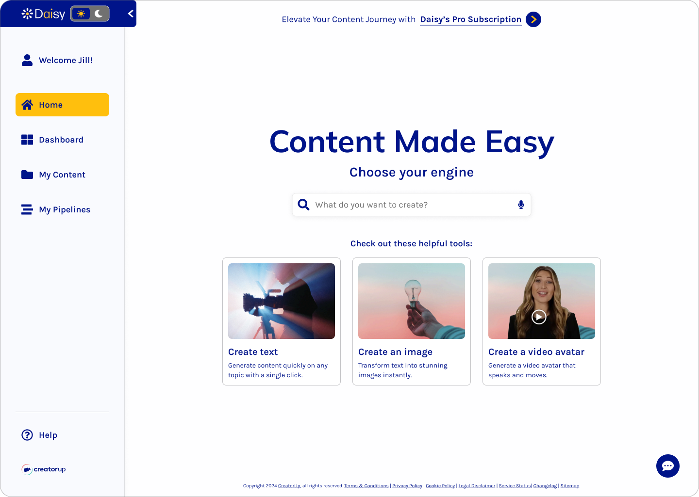
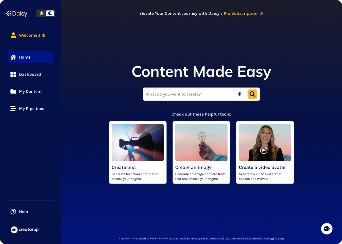
The homepage underwent several thoughtful rounds of iterations based on feedback from both the client and my design team. These adjustments aimed to align with project goals and address user needs, like improved readability, visual consistency, and overall usability. Some changes were driven by client requests, such as enhancing navigation, while others emerged from collaborative discussions within the team, like adding light/dark mode options, to refine the user interface and meet WCAG accessibility standards.
- Iteration 1 (Slide 1 below):
- Light/Dark Mode Theme Toggle: added to the top right of the navigation sidebar and an optional top banner
- Navigation Bar: renamed "Main" to "Dashboard" and reworked icons for clarity
- Iteration 2 (Slide 2 below):
- Navigation Bar: relocated the user account label to the bottom and added an account pop-up modal, including the light/dark mode theme toggle
- Headline: updated the headline typeface to Mulish, creating a simple yet impactful contrast to the body typeface, Karla, for added visual variation
- Search Bar: iterated on a simplified search bar, similar to Google's search bar
- Iteration 3: Final Design (Slide 3 below):
- Navigation Bar: revised the margins to align with the grid, added arrows for collapsing the sidebar, and updated the active navigation label from Reflex Blue to Gold for increased contrast and visibility
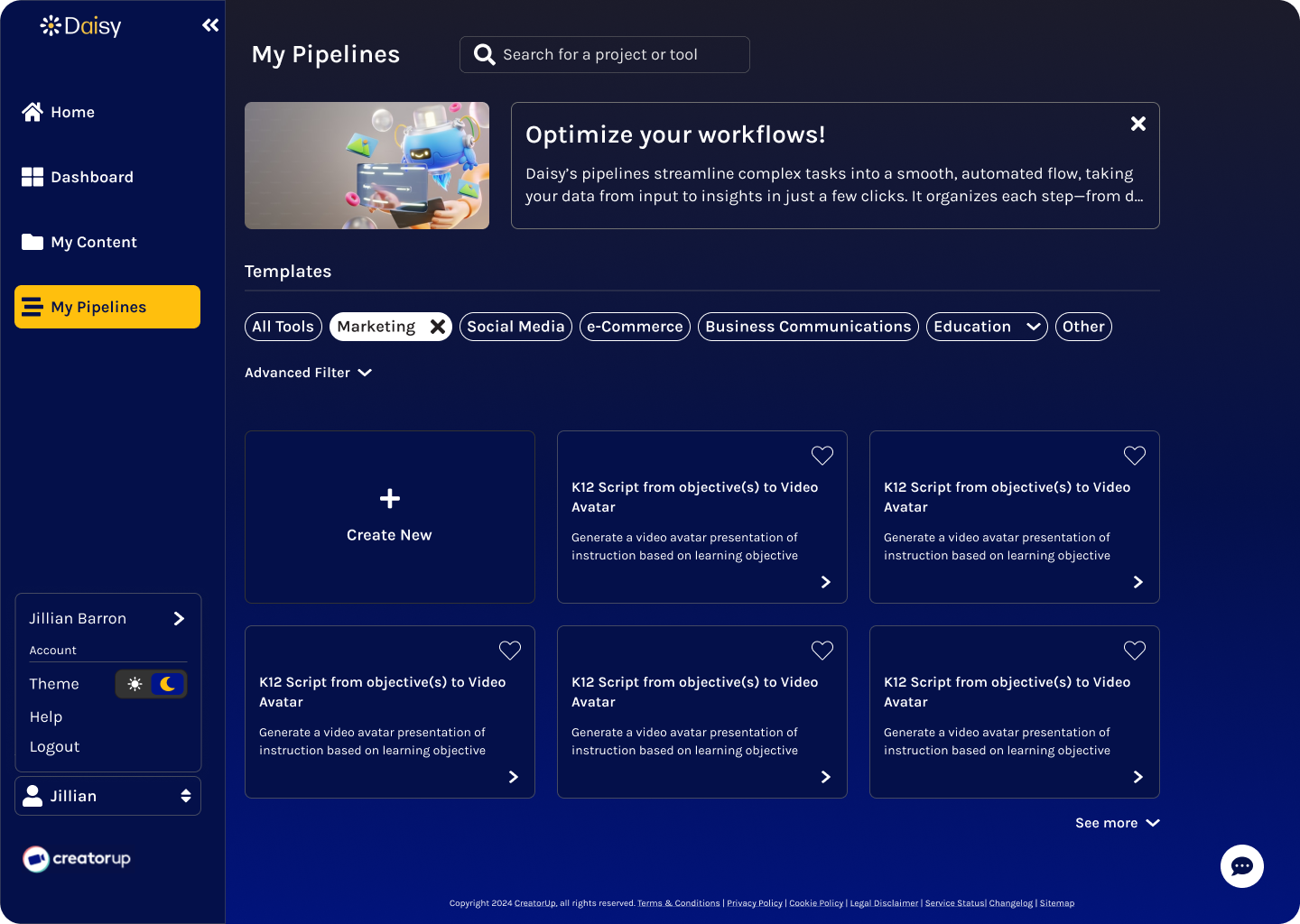
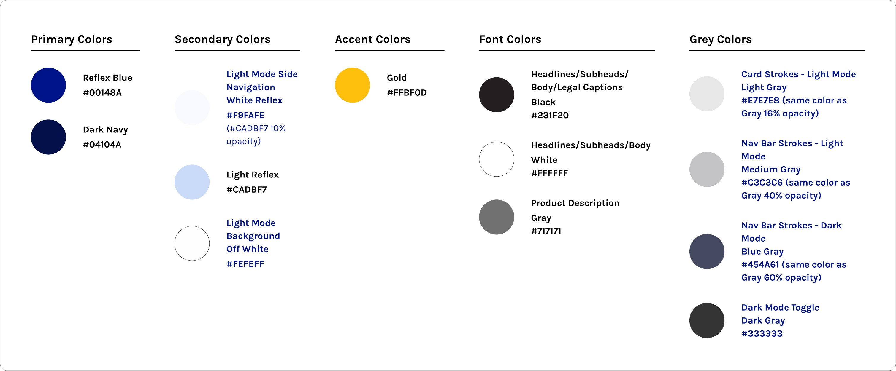
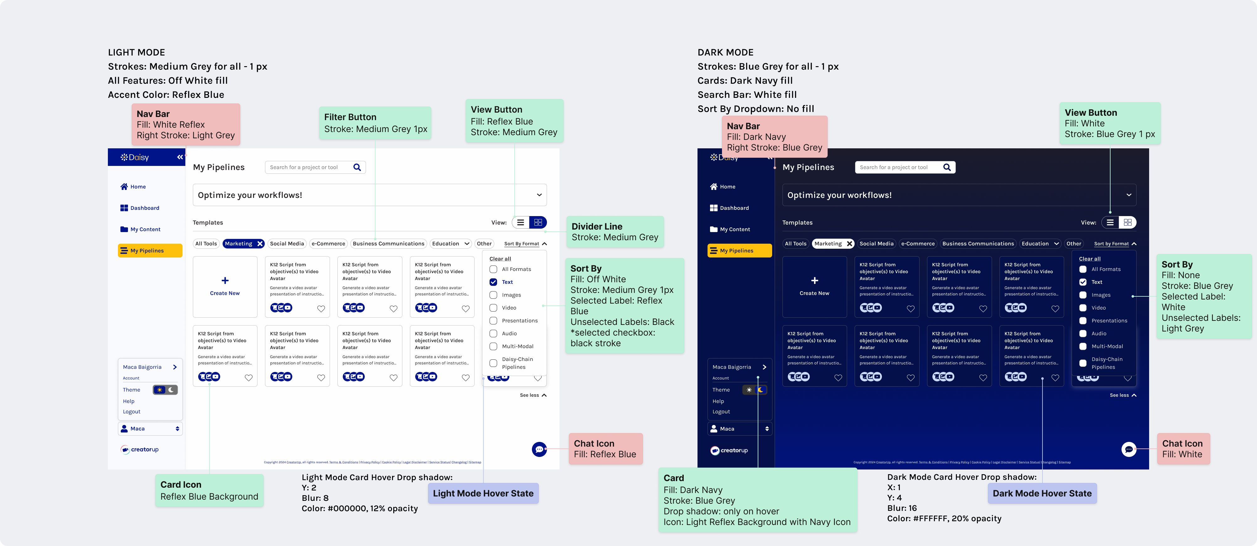
- Colors: refined and aligned fill and stroke colors across all four screens for consistency (Dark Mode: Blue Grey strokes and Dark Navy fills, Light Mode: Medium Grey strokes and Off White fills)
Sprint 2: My Pipelines Page
Research
Once I finalized the homepage screens, it was time for me to tackle the challenge of the My Pipelines page.
Challenge
My Pipelines is a central yet complex feature that allows users to combine multiple functions, like text, audio, and image, in one prompt sequence and eliminates the need for prompt engineering. However, users struggled to understand its capabilities, given the intricate functionalities and lack of guidance. My role evolved to focus on creating a user-friendly, intuitive experience for this page, which required understanding how users interact with the pipeline feature. Through hands-on testing and competitive analysis, I aimed to make this page more accessible and understandable.
Competitive Analysis
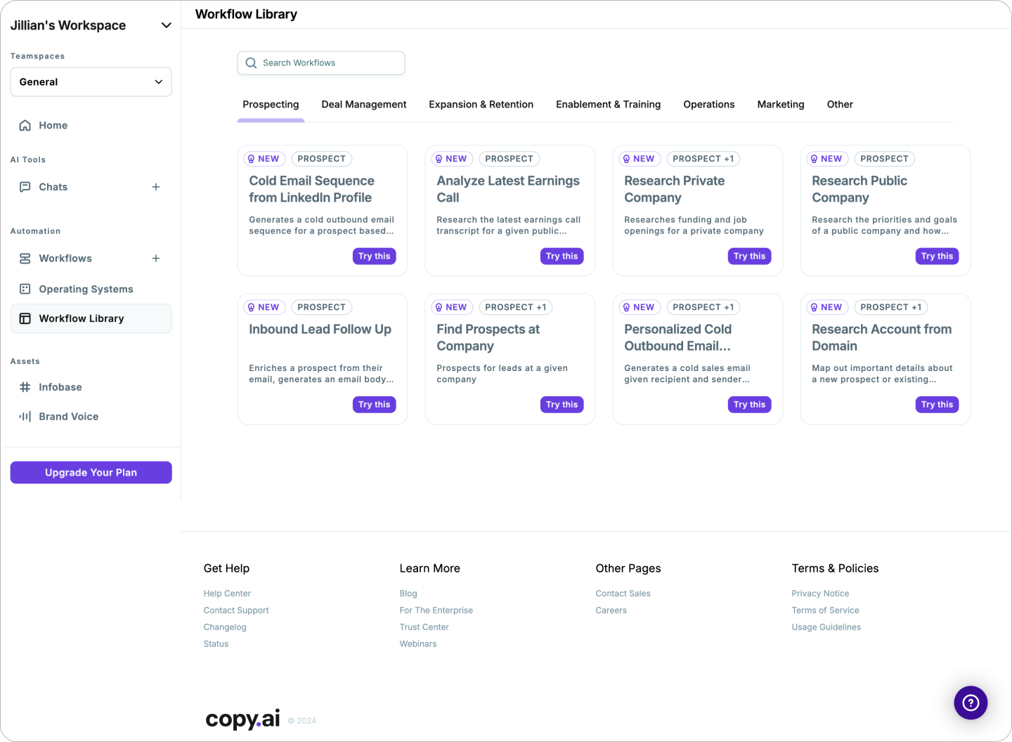
I conducted a competitive analysis of AI platforms like Copy.ai, Jasper, and HeyGen to examine how they presented similar workflow tools. Additionally, I explored Daisy's pipeline tool, testing its functionalities to understand its complexity. Highlights from the findings were:
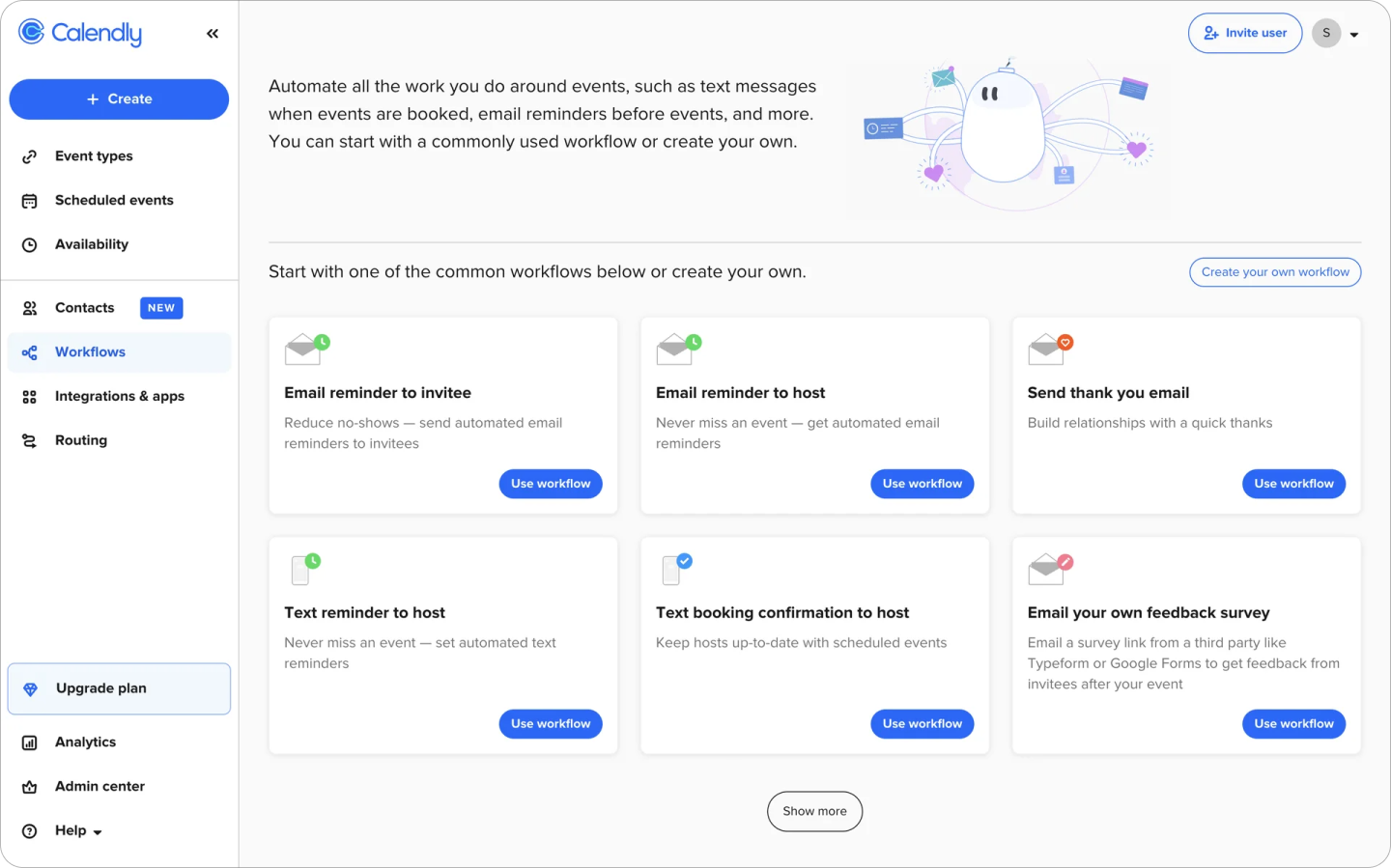
- Tooltips and Contextual Help: For complex features like My Pipelines, incorporating tooltips and in-context help, like in Calendly's workflow page, is essential for guiding users through unfamiliar tasks, making the tool more approachable and reducing frustration.
- Customization Features: Tools that offer flexible views, such as the ability to minimize or expand features, give users greater control over their workflows, enhancing usability and engagement.
- Clear Workflow Visualization: Platforms like Jasper use progress indicators to make pipeline stages clear, helping users track their workflow more easily.
Existing Product Evaluation
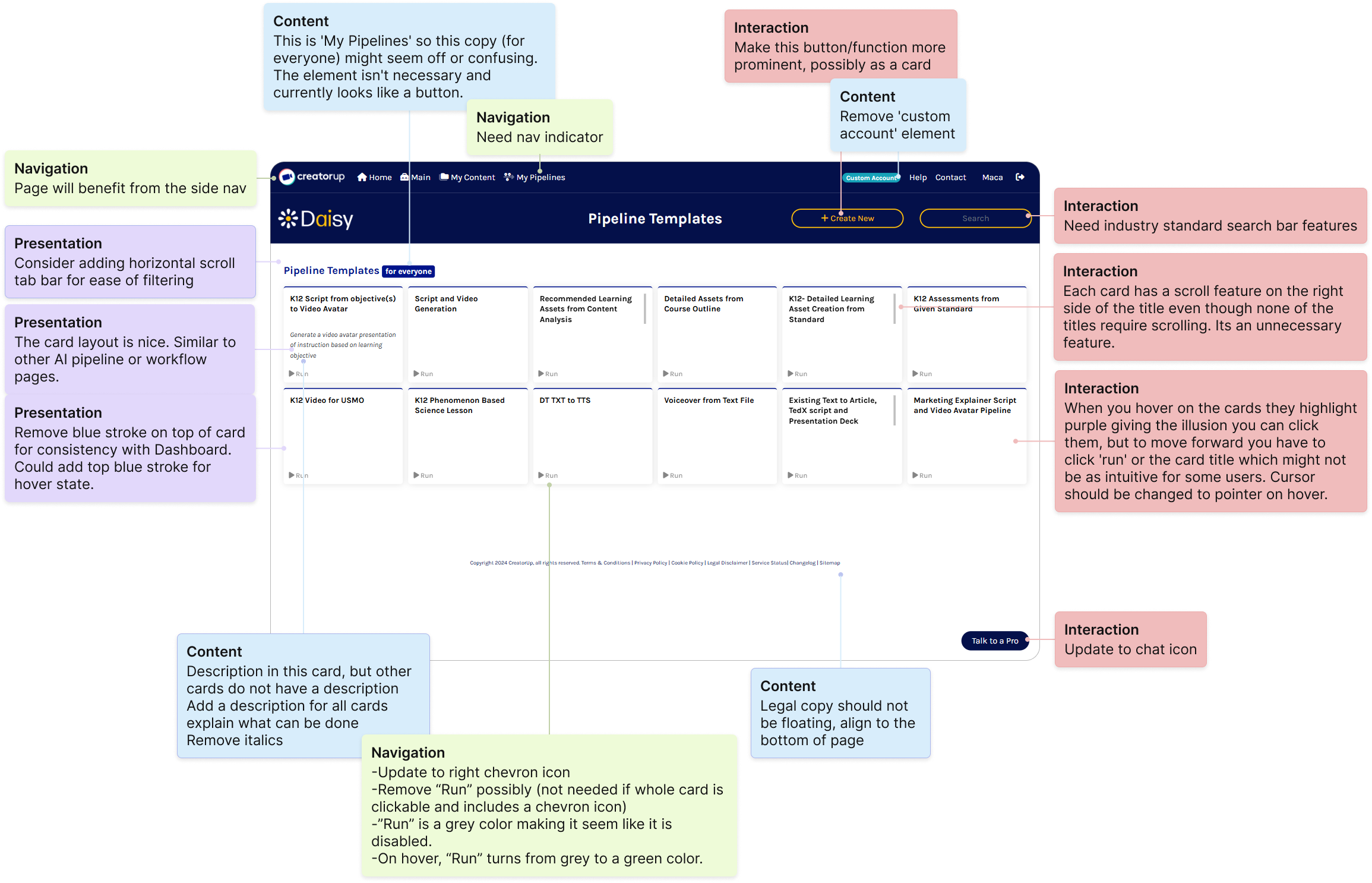
Next, I conducted an NCPI (Navigation, Content, Presentation, Interaction) evaluation of the existing page, which revealed a lack of functionality and consistency. For example, the pipeline cards were only partially clickable, and only one card included a description explaining its capability. I annotated the webpage with my observations, which can be seen in the image below.
I then analyzed how other AI platforms approached similar challenges and identified opportunities to improve clarity and usability.
Key Takeaways
The complexity of My Pipelines required a deeper focus on clarity and user assistance. Based on my research, I prioritized adding tooltips and contextual help on the page. I also made sure customization features were easy to use, helping users interact with the page without feeling overwhelmed.
This research-based approach would allow me to design a more user-friendly and accessible My Pipelines page that aligned with Daisy's goals of simplifying complex workflows for content creators.
Ideation
Redesigning the My Pipelines page presented a unique challenge due to its complexity. My primary goal was to help users understand the capabilities of this tool, which has advanced features that need to be communicated clearly.
Low-Fidelity Wireframes
To address this, I designed low-fidelity screen options, exploring different approaches for displaying the My Pipelines tool. I created two distinct options:
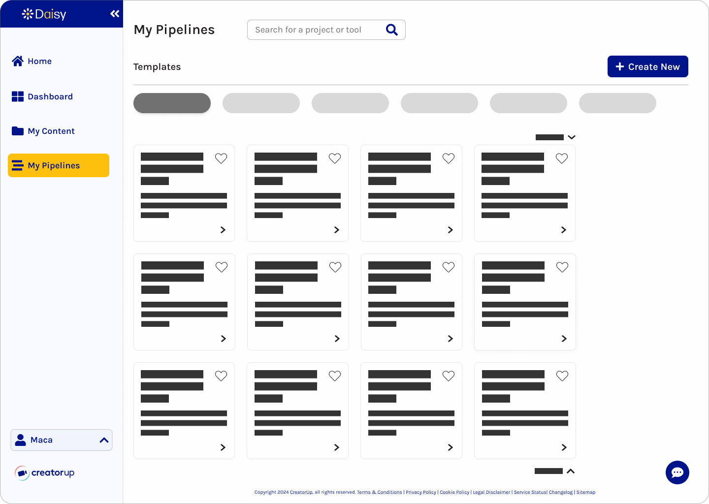
- Option 1: A simple layout with small cards aligned to the card size on the Dashboard page, featuring the "Create New" button at the top of the screen
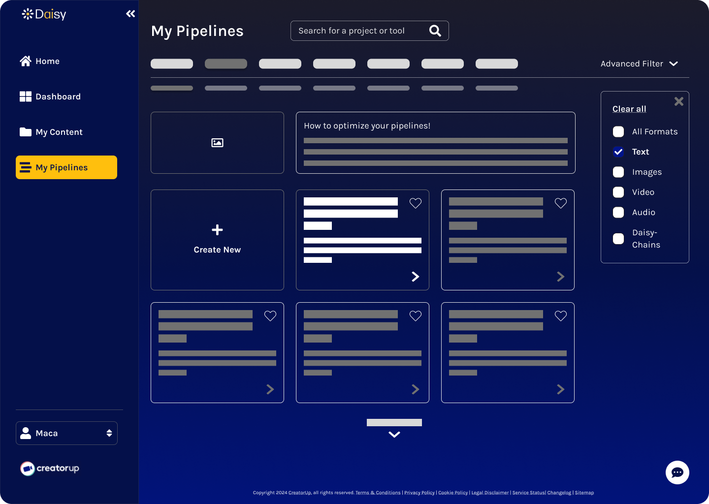
- Option 2: Wider cards for more white space, a "How-To" section for contextual help to explain the capabilities, and a "Create New" button as the first card
Both designs included options to filter, sort, and see more/less cards to enhance customization. I incorporated a "How-To" section to explain the complex pipeline tool, which I found to be especially effective in other platforms. These elements were added to provide clear guidance without overwhelming the user.
Final Decision: Present both card widths to the client. Proceed with the "Create New" button as the first card and the "How-To" section.
Key Takeaways
The decision to include customized views and contextual help was driven by my research into user needs. By giving users control over how they interact with the page and offering clear, accessible explanations, I aimed to reduce confusion and improve overall usability. These design explorations were critical in helping users better understand the tool's capabilities, ultimately creating a smoother experience that aligns with Daisy's mission to empower content creators through intuitive and accessible technology.
High-Fidelity Designs
The My Pipelines page required iterations to address the key challenge of helping users understand the tool's advanced capabilities in a clear and approachable way. This was critical to reducing user confusion and improving engagement.
To refine the design, I focused on three key tasks:
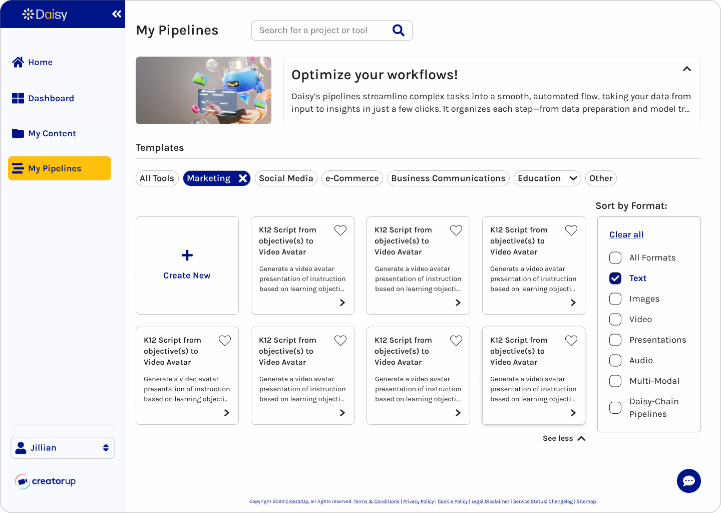
- Consistent Card Design: I revised card layouts for clarity and accessibility, ensuring each card included descriptions of its capabilities to make the tool's purpose immediately understandable.
- Customizable Views: I enhanced filtering and sorting options and introduced the ability to switch from a card view to a list view, giving users greater control over their view.
- Contextual Guidance: I further developed the "How-To" section with a concise explanation and helpful visual to guide users through the tool's functionality without overwhelming them. Also, I gave users the ability to minimize and expand this section.
Challenge
The challenge was balancing the tool's complexity with a user-friendly design. To overcome this, I drew from user feedback, my NCPI evaluation, and research on similar AI tools. I iterated on the designs to integrate clear guidance while maintaining a sleek and intuitive interface. These decisions were driven by the need to simplify complex workflows and empower users. The customizable views allow users to tailor the interface to their preferences and the "How-To" section reduces learning curves.

How-To!
On the existing website, users struggled to understand My Pipelines' capabilities, given the intricate functionalities and lack of guidance.
By adding this section, users can quickly grasp the My Pipelines' purpose, improving usability and confidence.
Key Takeaways
The resulting high-fidelity designs not only clarify the tool's advanced features but also align with Daisy's mission to provide innovative and user-friendly technology for content creators. These iterations directly address user pain points, enhancing the overall user experience and strengthening the platform's value. The final designs are expected to increase customer retention and drive sales growth.
Iterations
The My Pipelines page evolved through multiple iterations to address both client feedback and insights from the design team. The client emphasized the need to simplify complex tools for users, while the team identified opportunities to enhance flexibility and usability through customization features based on internal reviews. My analysis of areas where users might encounter friction guided many of these refinements, resulting in a more intuitive and adaptable interface that is better aligned with user needs and project goals.
- Iteration 1 (Slide 1 below):
- "How-To" section: incorporated this section to explain the complex pipeline tool and included the option to minimize this section
- "Create New" button: repositioned as the first card to streamline the workflow
- Sort By Format: iterated on a sort by format modal that would remain open by default
- Iteration 2 (Slide 2 below):
- View: introduced a "View" toggle so that users can switch between card view and list view
- List View: created the list view along with stacked icons within the list items to demonstrate the tools of the specific pipeline
- Iteration 3: Final Design (Slide 3 below):
- "How-To" section: refined this section to include the image within the frame for ease of collapsing and expanding
- Card View: added stacked icons, repositioned the favorites icon to the bottom left, and removed the right chevron icon
- Sort By Format: modified the modal to remain closed by default and aligned it with the filter buttons for a cleaner interface
Delivery
Design System
Inspired by CreatorUp's brand guidelines, we built an accessible, tech-forward design system for Daisy.
Accessibility
Evaluating the current website, at the start of Sprint 1, revealed poor color contrast and unintuitive icons, like a wand icon for search. I improved accessibility to meet level AA WCAG standards and refined iconography for clarity.
Tech Trends
My research on AI platforms highlighted the trend of colorful backgrounds. For dark mode, I designed a subtle gradient for depth and visual interest. We used Daisy's gold as an accent color guided by the 60-30-10 rule.


Color Inconsistencies
In Sprint 2, I prioritized consistency in color and components. While inspecting our light and dark mode designs, I noticed inconsistencies in fill and stroke colors. To address this, I created the color reference guide below and collaborated with the team for alignment.
Final Result
After discussing with the team and my senior designer, we standardized the fill and stroke colors – one for light mode and one for dark mode, creating a cohesive and polished design.
Client Handoff
Quality Inspection
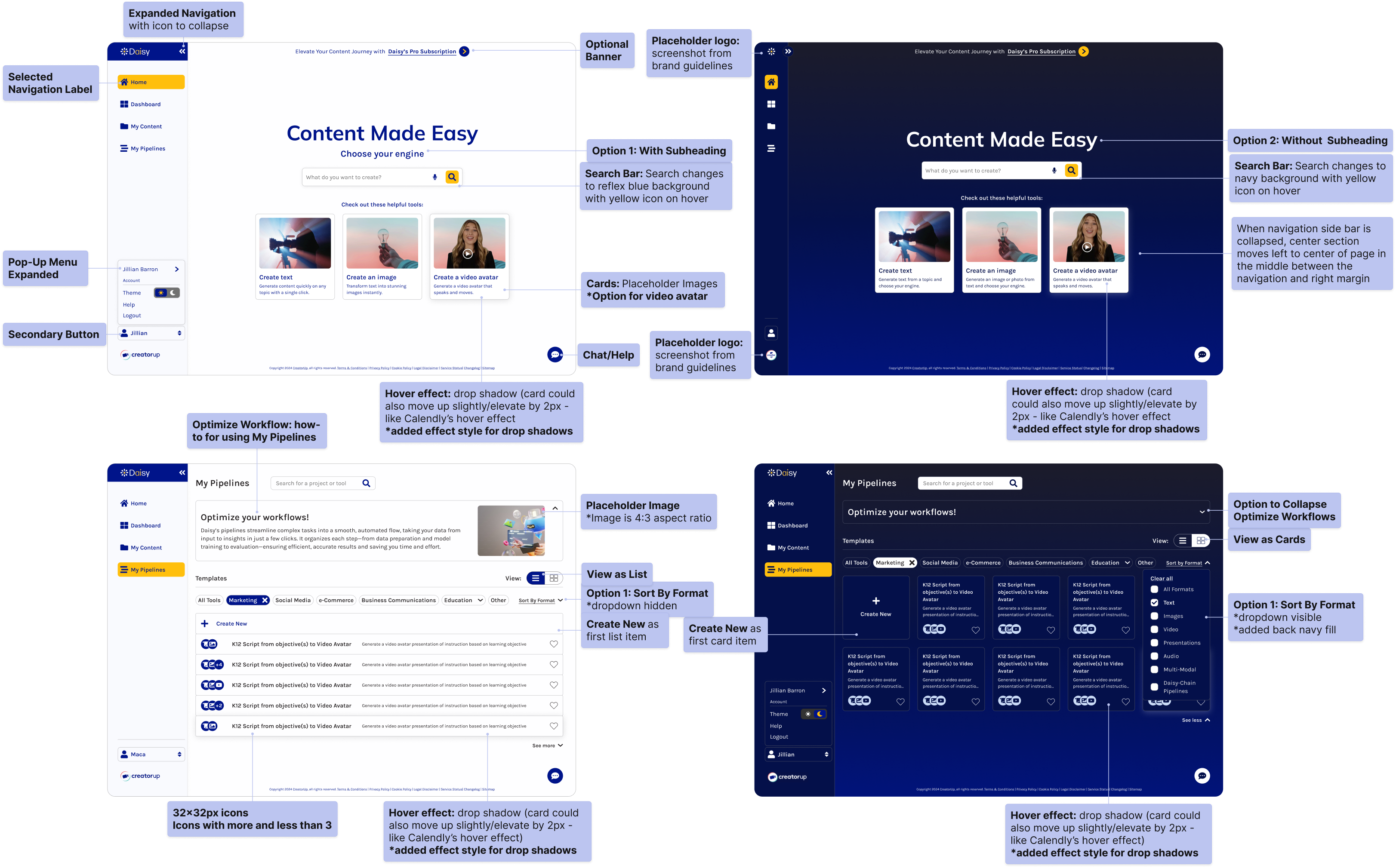
After a thorough quality inspection, I collaborated with my team to finalize the screens to present to the client, ensuring we showcased the most impactful designs. I annotated the designs to explain features like the collapsible navigation bar and the "How-To" section, which received excellent client feedback. I also prepared the final design system and refined components for consistency.
Success!
This approach ensured a successful handoff, with screens that were easy to navigate and understand.
Reflection
Lessons Learned
During this project, I gained valuable insights into balancing user needs with accessibility and design consistency. Working remotely and asynchronously, I learned the importance of following gridlines and guides for team alignment across light and dark modes.
Biggest Challenge
One of the biggest challenges was managing multiple ideas within tight timelines. While generating diverse options was valuable, it sometimes hindered my ability to refine and simplify. In Sprint 2, narrowing down the My Pipelines layout options earlier would have allowed more time for testing and iterating. Similarly, simplifying the homepage features, like the user account modal in the navigation bar, could have streamlined decision-making in Sprint 1. To overcome this, I leaned on feedback loops with my team and established clearer priorities, which helped me identify the most feasible options faster.
If I had more time, I would prioritize reducing initial options to focus on fewer, more targeted solutions. This approach would ensure clarity and simplicity while leaving more time for iteration and feedback. In future projects, I would like to focus on aligning ideas and components early, especially when working remotely.
Future Thinking
Moving forward, I will continue refining my skills in designing for the nuances of light and dark modes. This project reinforced my commitment to balancing innovation with usability while aligning with user expectations and business goals.
Final Thoughts
Working within an agile approach allowed me to stay flexible during design sprints, quickly refine ideas, integrate feedback, and adjust the designs to meet changing requirements. My team and I ultimately delivered a usable, accessible product that reflects Daisy's mission to simplify complex tools and will enhance user engagement, retention, and sales growth.
Wins
- A major win was the strong team collaboration, with regular communication for feedback and alignment, which ensured we consistently met deadlines throughout the project.
- I also succeeded in balancing accessibility with a tech-forward design, ensuring color contrast met standards while maintaining a cohesive aesthetic for both dark and light modes.
- Another highlight was the successful integration of the "How-To" section in the My Pipelines page, which provided clarity for users and received positive client feedback.

