loading circle

ColliMate Space

B2B AI/ML responsive platform enabling rapid, scalable delivery of life-saving data from space to Earth

ColliMate Dashboard Mockup

Overview

ColliMate Space is revolutionizing satellite communications with an AI/ML responsive platform that enables satellite operators to optimize scheduling with ground stations, automate data transmission plans, and account for weather and signal interference in real time.

By reducing data transfer times from hours to seconds, the software ensures rapid delivery of critical data for life-saving operations, like natural disaster response and national security needs, bridging the gap between space and Earth.

My Role

Dashboard Team Leader (Team of 4), UI/UX Designer (Team of 8, including Senior Designer and Product Manager)

Tools

Figma, Adobe Photoshop, Monday.com, Slack, Mobbin, Google Suite, ChatGPT

Process

Discovery – Sprint 1 – Sprint 2 – Delivery – Reflection

Problem

The existing platform, built quickly to meet initial demands, lacked a modern, responsive design that aligned with the brand of credibility and innovation. As the company evolved, their vision was refined, requiring an upgraded, intuitive design to engage potential customers and investors.

Solution

Our team elevated the website and dashboard with a cohesive design system and engaging responsive layouts. The improved dashboard integrates eight essential features in one intuitive screen, like 3D and 2D map views, ground station details, satellite timelines, and metrics. The responsive enhancements align with ColliMate's brand vision and are expected to increase investor interest, attract new customers, and boost retention rates.

Impact

  • I led a sub-team of 4 designers to achieve 95% adherence to design standards, ensuring visual and functional consistency across 40+ responsive screens.
  • Collaborating in an agile, remote design team of 8, I managed stakeholder feedback and met deadlines during 2 design sprints, leading to a successful client handoff with developer-ready files.
  • We implemented responsive text and color variables and reusable components, increasing design efficiency by 30% and reducing iteration time by 20%.
Satellite Icon
1
Discovery
2
Sprint 1
3
Sprint 2
4
Delivery
5
Reflection

Discovery

Kickoff

At the start of the project, my team and I met over Zoom, where we learned that tech startup, ColliMate Space, had prioritized product development and was in need of design expertise to elevate the user experience of their website and dashboard. We started with an existing product and client intake questionnaire. We were then able to define our process steps and deliverables in the redesign of the website and dashboard.

Client Takeaways

From the initial client intake questionnaire, I gathered the following takeaways that would guide my design process through 1 to 2-week sprints:

  • ColliMate Space provided the brand keywords of credible, adaptive, and forward-thinking.
  • The client wanted users to feel that their platform was automated and transparent, but also scientifically sound and modern.
  • ColliMate targeted satellite operators, including highly skilled engineers, many with PhDs, ages 30-50 years old, and company leadership at prospective customer organizations.

Secondary Research

Upon joining the ColliMate Space project, I reviewed the project's goals and documentation in detail to fully understand the company's challenges.

Dark Mode and Glassmorphism

With a platform-wide vision to use dark mode and glassmorphism, I researched best practices in these areas, discovering important takeaways, such as:

  • maintaining visual balance
  • controlled translucency
  • clear element hierarchy
  • achieving high color contrast
  • subtle layering for glassmorphism
Glassmorphism
Dark Mode and Glassmorphism Exercise

Responsive Analysis

To prepare for the responsive design, I conducted a competitive analysis, comparing platforms like SpaceHub, Aalyria, and Quindar to assess responsive behavior across devices, enhancing my approach to imagery and text adaptation.
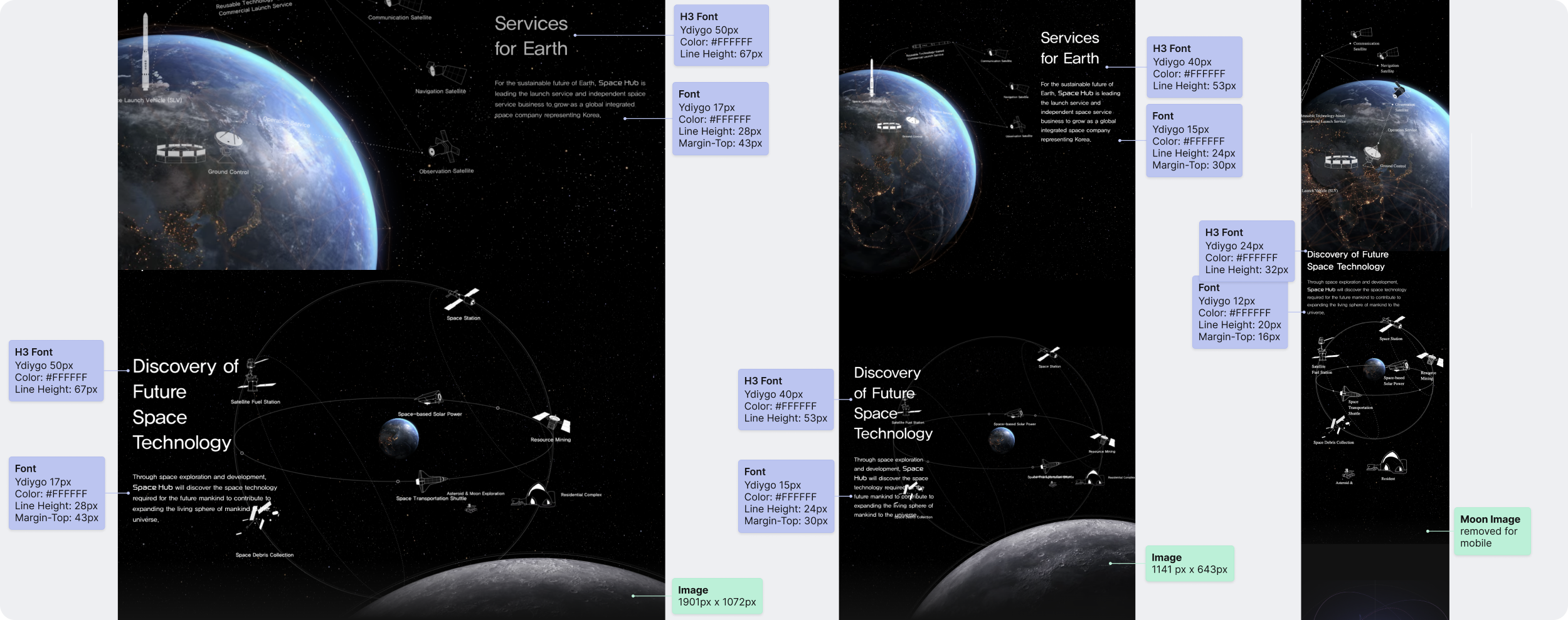
Competitor Annotations
SpaceHub: Responsive Annotations

Sprint Context

With our scope decided, we divided the redesign into two distinct sprints. Each sprint consisted of Research, Ideation, Design, and Iteration processes. Within each sprint, I had an area of responsibility to limit scope and focus on individual features of the dashboard.

Sprint 1: Desktop Dashboard (3D and 2D Earth Views, Navigation, Ground Station Details)

Sprint 2: Mobile and Tablet Dashboard (3D and 2D Earth Views, Navigation, Ground Station Details)
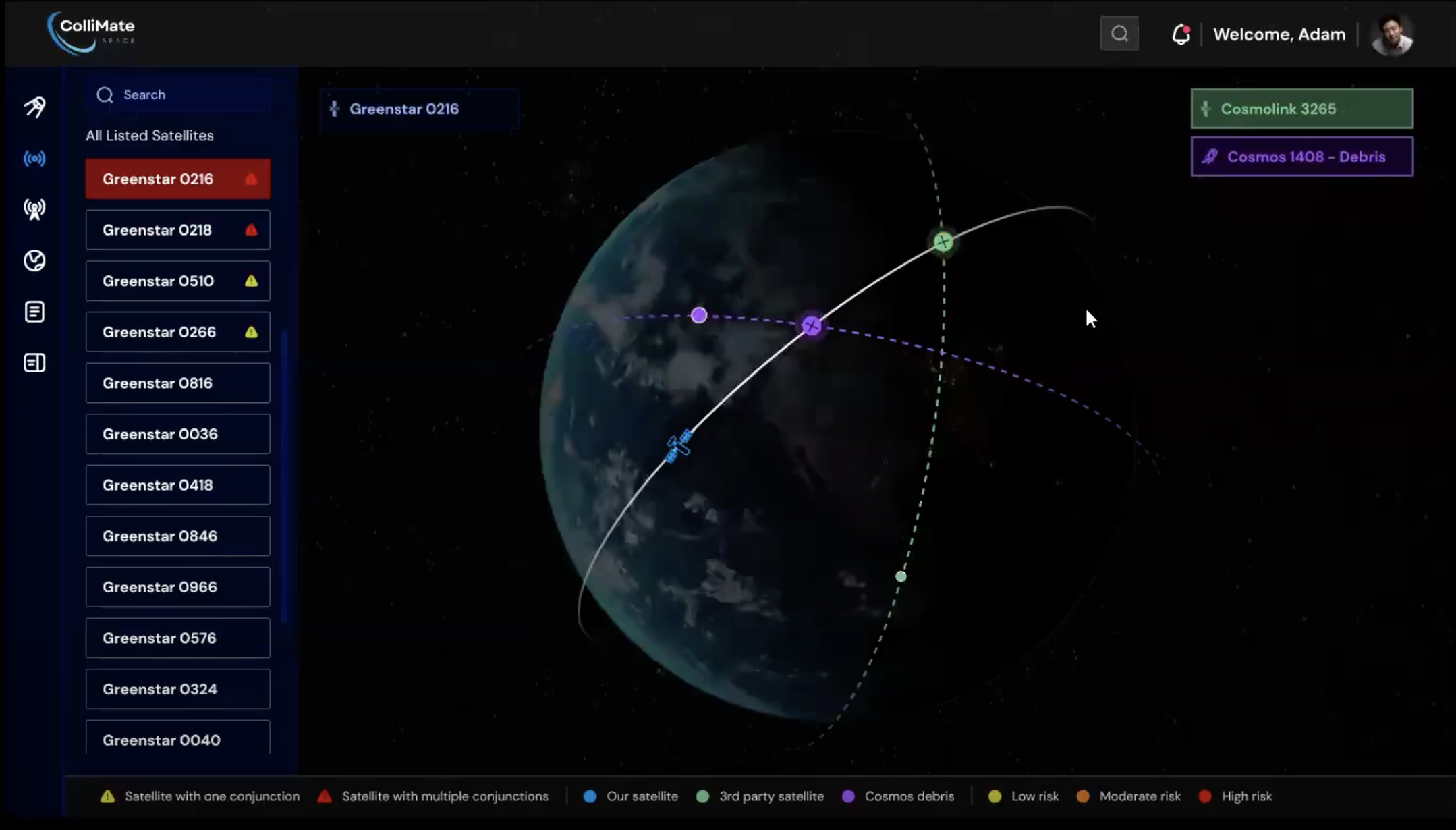
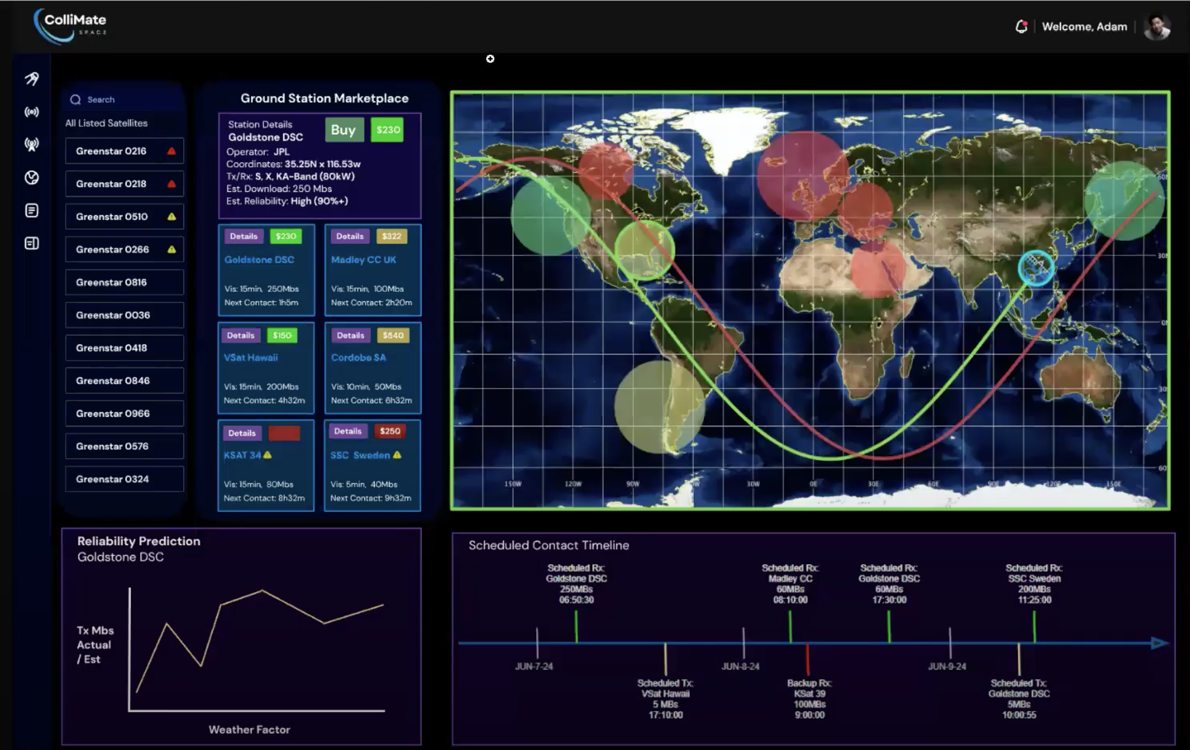
Existing Dashboard
Existing Dashboard Screen #1
Existing Dashboard
Existing Dashboard Screen #2

Sprint 1: Desktop Dashboard

Research

For the ColliMate Space project, my role was to co-create an intuitive dashboard. My specific focus was to design 2D and 3D map views, map navigation tools, and ground station details.

Competitive Analysis

To prepare for the dashboard design, I conducted a thorough competitive analysis, comparing platforms like Aalyria and Quindar.

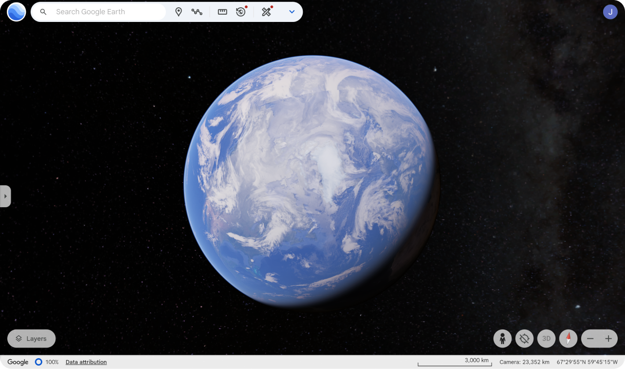
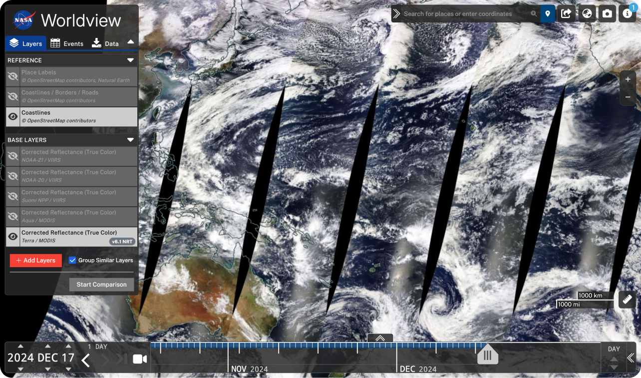
I also explored websites for map view inspiration, like Google Earth and NASA Worldview. Key insights emerged that shaped the dashboard's layout and usability, including:

  • trends in satellite mapping
  • map view displays
  • a responsive top navigation bar
  • optimal use of white space

Key Takeaways

This research guided my subsequent design decisions, enabling me to integrate modern and visually cohesive solutions tailored to ColliMate's innovative brand and user needs.

Google Earth
Google Earth
NASA Worldview
NASA Worldview

Ideation

User Story

At the start of the ideation process, my team and I received new direction from the client regarding their refined vision for the web application. Below is my assigned user story, Earth View, which proposed the exciting challenge of designing intuitive and engaging 2D and 3D map views with graphics and interactive tools, such as map visualizations and ground station details.

User Story: Earth View
    A user can:
  • see view of the Earth as the prominent screen feature and toggle between a 2D Projection and a 3D Globe
  • view the position of their company satellites
  • see the selected satellite and a line that shows the orbital path
  • see ground stations and their locations on the Earth
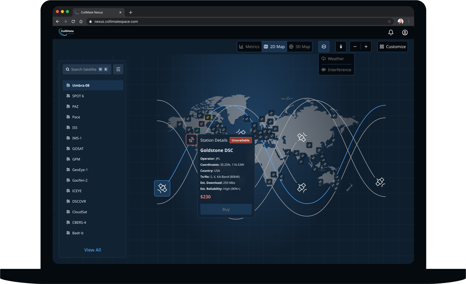
  • select a ground station to show the ground station's details, like latitude/longitude, owner of the ground station, country, radio band and frequency letter codes, and availability status (available, booked, unavailable)
  • see certain ground stations indicated as not available for their use, like if they do not have agreements with these stations
  • apply filters on the Earth view to overlay data, like weather and interface, sourced from public APIs in the development stage, to aid decision-making

Ground Station Availability Status

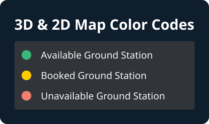
The first challenge I tackled was determining how to represent ground stations on the map and indicate their availability status. To address this, my initial concept was to use a color coding system: green for available, yellow for booked, and red for unavailable.

Color Codes

Low-Fidelity Wireframes

One of the primary challenges was organizing 8 key features on a single dashboard screen, with the map as the focal element, while maintaining organization and clarity. To address this, I developed 2 low-fidelity screen options:

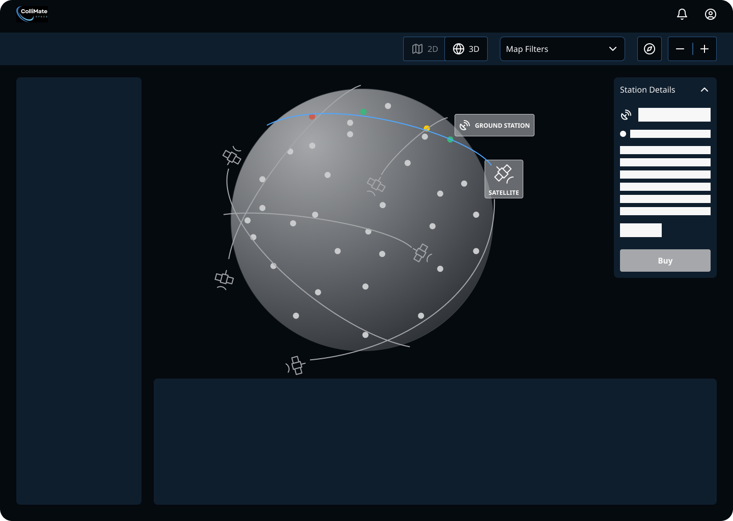
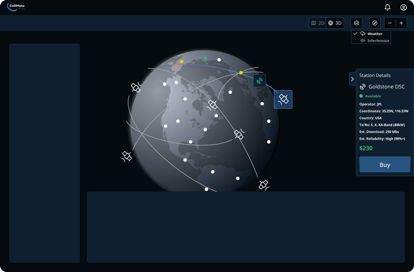
  • Option 1: 3D map with a fixed top navigation bar and collapsible panel for ground station details, including a minimalist toggle for a user-centered interface
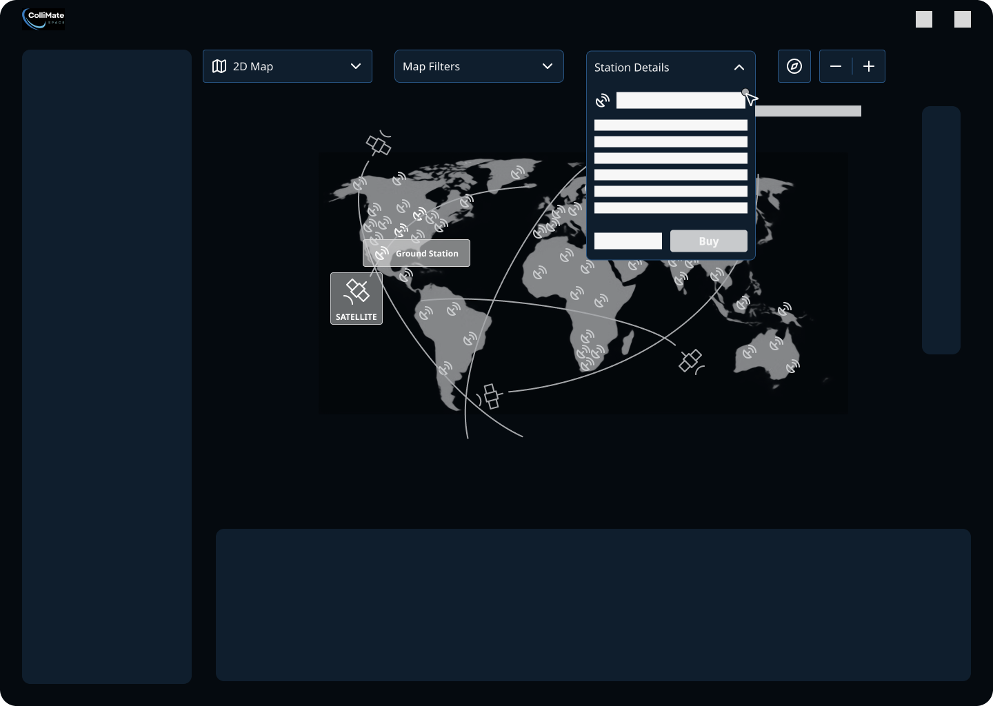
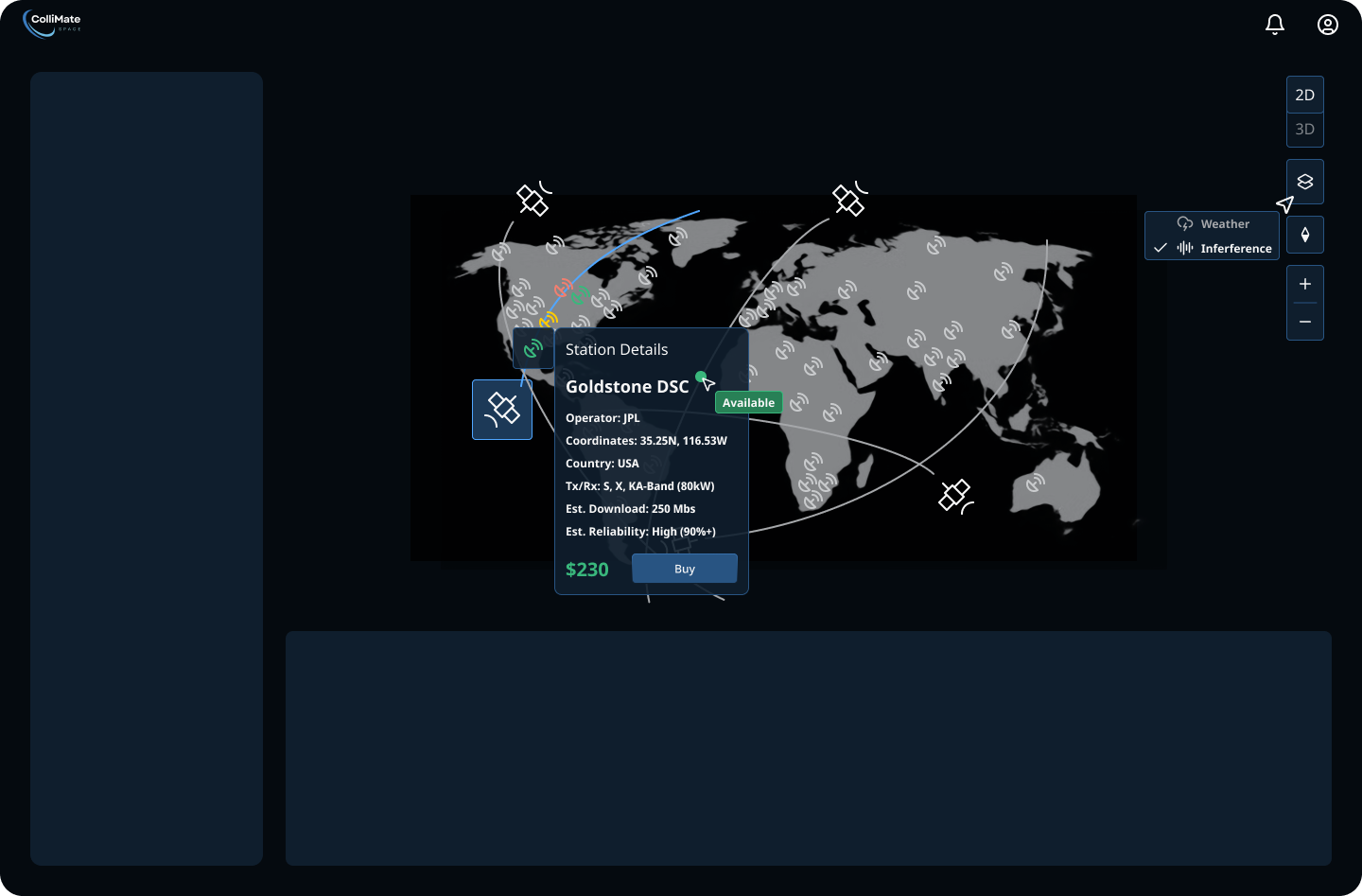
  • Option 2: 2D map with a floating top navigation bar and dropdown for ground station details to provide a seamless, unified view with readily accessible data

Key Takeaways

These designs addressed user needs by simplifying navigation and integrating new layout elements aligned with the client's vision. The adaptable, streamlined layouts bridged the gap between complex data and user-friendly design, reinforcing ColliMate's commitment to accessible, modern data visualization.

Chosen Ideation
Low Fidelity Option 1
Option 1: 3D map with a fixed top navigation bar and collapsible panel for ground station details
Low Fidelity Option 2
Option 2: 2D map with a floating top navigation bar and dropdown for ground station details

High Fidelity Designs

Transitioning from low to high fidelity involved close collaboration with my senior designer and 3 dashboard team members. Our main challenges were displaying all 8 features dynamically, optimizing the navigation, and reducing clicks.

For each of my assigned features, I explored two options:

  • Ground Station Details:
    • Collapsible drawer: content changes based on the selected element (like Google Maps)
    • Floating card: the user clicks on a satellite or ground station, revealing interactive options in a pop-up modal (similar to Airbnb's map)
    • Final decision: Present both options to the client
  • Navigation Bar:
    • Fixed, top horizontal bar with toggles to minimize clicks
    • Vertical, right sidebar with toggles (like Google Maps)
    • Final decision: Fixed, top horizontal tab bar for responsiveness and a more intuitive, seamless look
Chosen Navigation Bar
3D Map
Hi-Fi Iteration 1 for 3D Map: Collapsible drawer for ground station details and fixed, top horizontal navigation bar
3D Map
Hi-Fi Iteation 1 for 2D Map: Floating card for ground station details and vertical, right navigation bar
  • Map Views
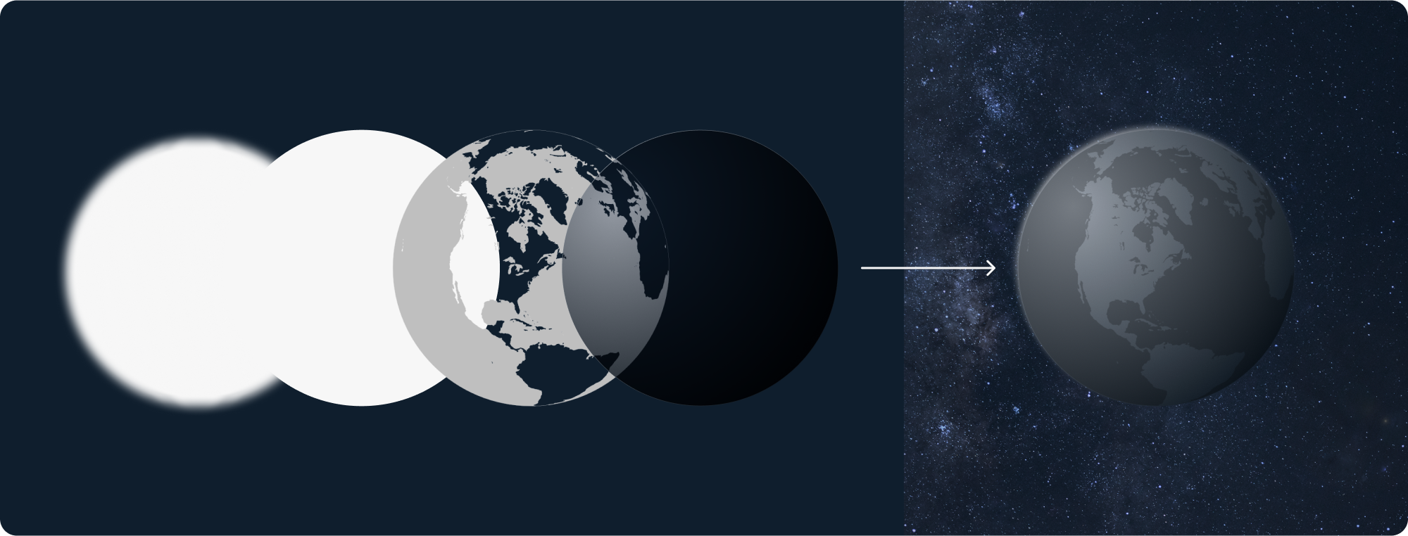
    • 3D map: I used my graphic design skills to create a layered look, aligning with dark mode and glassmorphism best practices. Once I selected a 3D globe image, I used layering techniques to enhance the dimension (white glow underlayer, opaque white middle layer, and gray radial gradient overlay with linear gradient stroke).
    • 3D Map
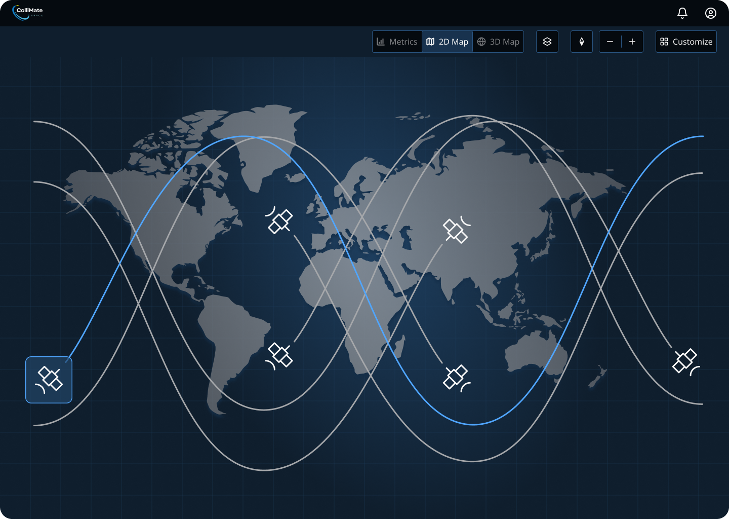
    • 2D map: I faced a unique challenge replicating the depth for the flat 2D map. After iterating and receiving feedback, I created a subtle blue grid background with a blue radial gradient for depth behind the map and a grey radial gradient with a subtle drop shadow to add definition to the map.
    • 2D Map
    • Final decision: Include both map views allowing users to toggle between them to customize their view.

Key Takeaways

By organizing data in a clear, cohesive structure, we addressed user needs for simplicity and navigability. The design will enhance user retention and support ColliMate's mission of bridging the gap between Earth and space.

ColliMate 2D Map View

Fun Science Fact!

Through further research, I discovered a fun fact that brought me back to middle school science class:

Elliptical satellite paths on a 3D map unravel to sinusoidal wave paths on a 2D map.

Inspired, I then integrated wave-like orbital paths into the 2D map view.

Satellite Icon

Iterations

The desktop iterations were driven by a combination of client feedback, team discussions, and my own design decisions to address evolving user needs and project goals. The client emphasized the importance of accessibility, usability, and clarity in navigation for satellite operators, prompting adjustments to the color palette and layout. Feedback from the senior designer and team during design sprints highlighted opportunities to refine map views and customization features to improve user control and adaptability. These iterations ensured the design remained aligned with stakeholder expectations while enhancing functionality and user experience.

  • Iteration 1 Options (Slide 1 below):
    • Fixed, top horizontal navigation bar with toggles to minimize clicks and collapsible drawer for an adaptable view
    • Vertical, right navigation bar with toggles and a floating pop-up modal for ground station details for an interactive view
  • Iteration 2 (Slide 2 below):
    • Fixed, top navigation bar: iterated on map view toggle switch, layer pop-up button, and compass icon for improved clarity
    • 3D Map View: added space image background
    • 2D Map View: created grid background and iterated on the 2D map and gradients to create depth like the 3D map
  • Iteration 3 (Slide 3 below):
    • Feature Background Colors: iterated on background colors of the design features using glassmorphic effects, like opacity and background blur
    • 3D and 2D Map Views: finalized ground station indicator icons and orbital paths
  • Iteration 4: Final Design (Slide 4 below):
    • Feature Background Colors: revised background colors of the design features to a darker blue to align with mobile and tablet for accessibility
    • View Customization: added "Customize" button to the top navigation bar so that users can customize their map view for more personalized options

Sprint 2: Mobile & Tablet Dashboard

Research

Once we finalized the desktop screens, it was time to tackle the challenge of responsive mobile and tablet versions of the dashboard.

Competitive Analysis

I started by conducting competitive analysis on sites, like Aalyria and Quindar, and identifying best practices for mobile and tablet dashboard and map designs. The primary challenge was translating the complex functionalities of the dashboard into accessible mobile and tablet views and maintaining consistency.

For the navigation and Earth views, I faced the challenge of reimagining elements for smaller screens. While researching, I aimed to understand how to prioritize information and adapt interactions for touch interfaces. For the map views, my research reinforced the need for interactivity, such as:

  • zoom in and out
  • a compass icon to reorient
  • a tooltip for dragging and pinching the map to zoom
  • increasing button sizes for touch targets

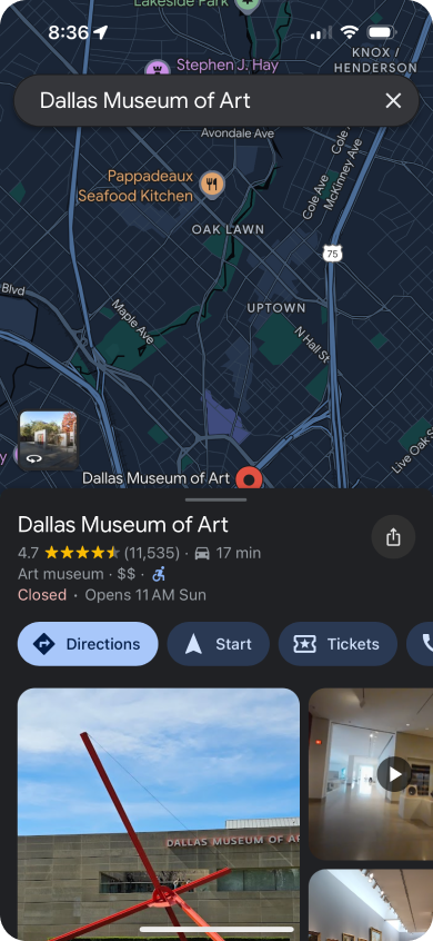
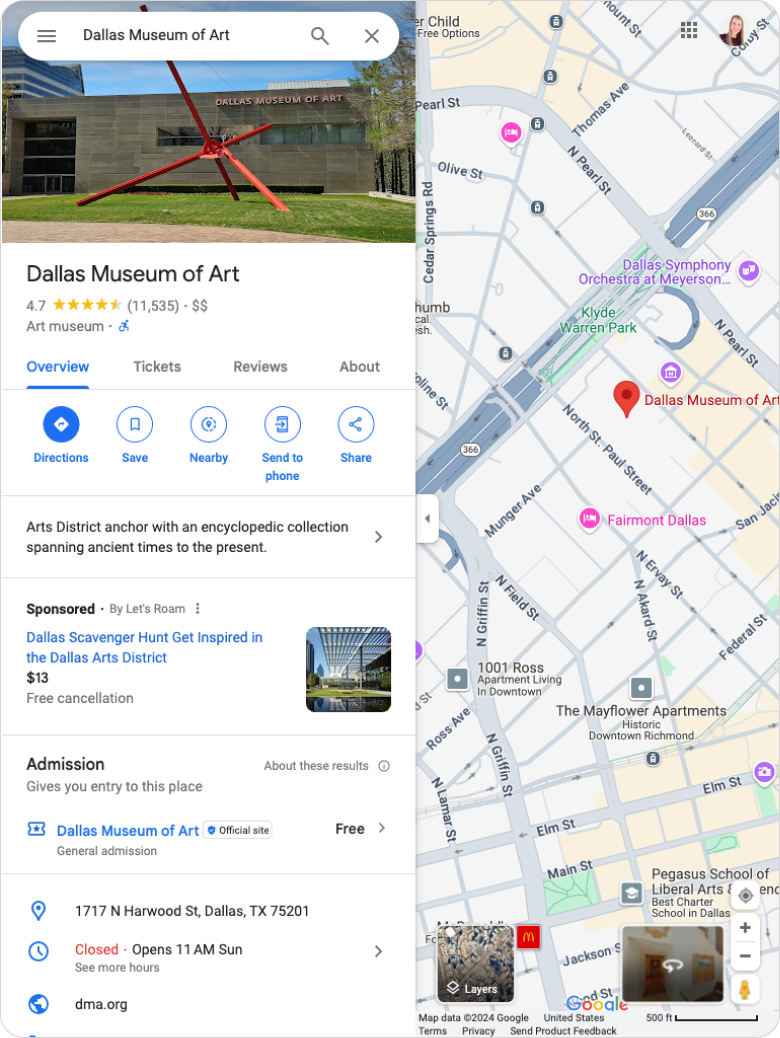
One takeaway was that traditional sidebars do not translate well to mobile interfaces. Instead, I explored transforming sidebars into bottom or full-page modals for more effective navigation, like Google Maps.

Key Takeaways

A significant takeaway was the importance of prioritizing core functionalities over aesthetics in mobile and tablet design. This meant simplifying the navigation to reduce clicks and relooking at the colors and glassmorphism effects for usability and readability. These insights directly influenced the direction of my designs, leading to a more cohesive experience across devices.

Google Maps iPhone App
Google Maps: mobile app bottom modal
Google Maps iPad
Google Maps: tablet view left side drawer

Ideation

Shifting my focus to mobile and tablet screens, the main challenge was to ensure that essential features remained accessible and functional within the limited screen size. I started by brainstorming various layouts and navigation structures.

Low-Fidelity Wireframes

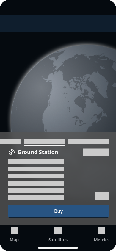
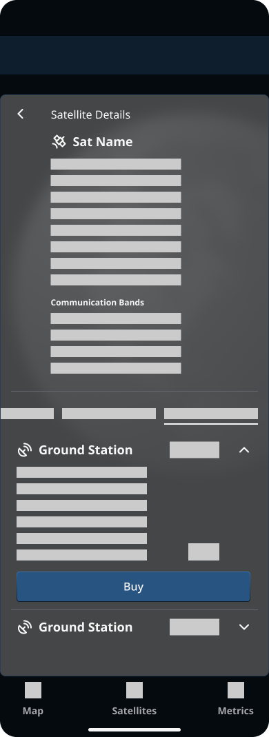
I explored a bottom tab bar navigation for mobile and considered turning sidebars and panels into bottom modals to enhance usability, using references of collapsible modals, like Google Maps. I presented two low-fidelity flow options for mobile:

  • Option 1: Bottom modal with a sliding tab bar, including satellite details, timeline, metrics, and ground station details
  • Option 2: Stacked option with the specific satellite details on top and timeline, metrics, and ground station details in a sliding menu at the bottom

I focused on a clear, simplified interface to prioritize essential features, which meant testing modal background colors and increasing font sizes to align with the design system and enhance accessibility on smaller screens. Each decision aimed to ensure that the designs were cohesive with desktop, but also functioned well on mobile and tablet, providing users with an engaging and seamless experience.

Key Takeaways

The ideation phase was crucial in setting the foundation for the mobile and tablet designs, allowing me to turn the Earth View user story into practical, actionable designs. By making thoughtful iterations, I ensured that the vision for a responsive dashboard would be translated into usable designs. This approach not only enhanced user engagement but also supported the broader goal of providing a unified experience across devices.

Chosen Ideation
Low-Fidelity Mobile Option 1
Option 1: Bottom modal with sliding tab bar
Low-Fidelity Mobile Option 2
Option 2: Stacked bottom modal

High Fidelity Designs

As we progressed to high-fidelity mobile and tablet designs, the biggest challenge was balancing simplicity and functionality to keep essential information accessible on smaller screens. To address this, our team leveraged iterative feedback from the senior designer and client, refining the interactivity to ensure users could access information seamlessly. Based on feedback from low-fidelity flows, we proceeded with the bottom modal for satellite details, metrics, and timeline, along with separate modals for station details and global metrics.

Client Feedback

During Sprint 2, a significant point of client feedback I received was the 3D and 2D map views felt cluttered.

Solution

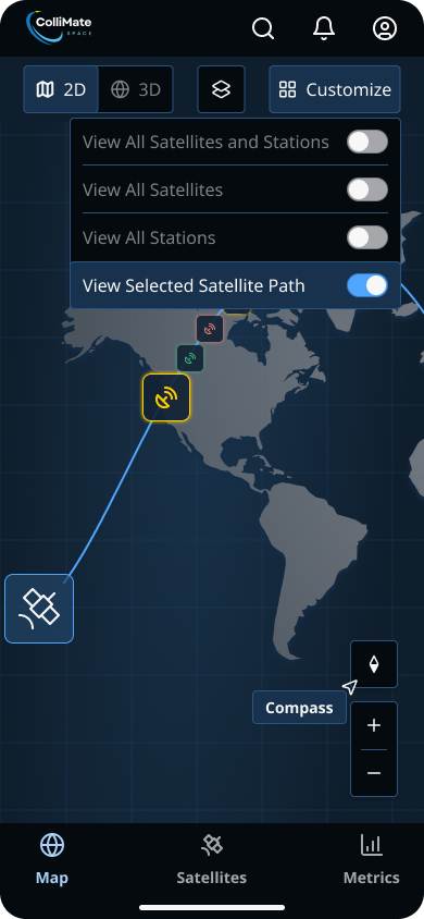
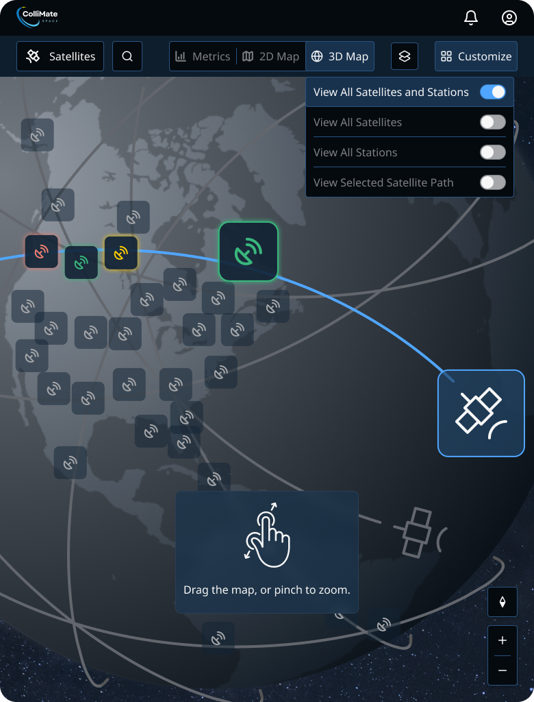
After brainstorming with my senior designer on possible solutions, I added a customization option in the top navigation to give users the control and freedom to tailor their map views, reducing clutter while preserving core functionality.

    To achieve this, I made 3 key changes:
  • Implemented 4 view options, allowing users to toggle essential features for a less overwhelming interface
  • Repositioned interactive map elements for accessibility without interfering with map views
  • Added color highlights for selected features to improve navigation

Creating these customized map views across devices was crucial, but adding another button in the top navigation bar presented space limitations on mobile and tablet. To solve this, I moved the zoom and compass controls to the bottom right on mobile and tablet screens, inspired by Google Maps and NASA Worldview. This placement further improved the user experience by positioning map controls within thumb reach for touch screens. Finally, I updated the button sizes to 44x44px to ensure accessibility and easy interaction.

Final Design
Mobile Touch Screen
Mobile Final Design: customize view
Final Design
Tablet Touch Screen
Tablet Final Design: customize view

Iterations

The tablet and mobile designs went through a series of thoughtful iterations based on a combination of client feedback, team discussions, and my own usability considerations. The client emphasized aligning the tablet and mobile designs with desktop features while maintaining device-specific usability, driving changes in navigation and layout. Feedback from the senior designer and design team highlighted opportunities to improve accessibility and ensure consistency across platforms. These adjustments were made to create a seamless experience tailored to user needs across devices.

  • Iteration 1 (Slide 1 below):
    • Tablet: reverted to drawer/pop-up modal for ground station details rather than a bottom modal to align with desktop
    • Mobile: iterated on a two-column option for the ground station details bottom modal to allow for greater visibility of the maps
  • Iteration 2 (Slide 2 below):
    • Tablet: added satellite search option to navigation to replace the satellite sidebar on desktop screens
    • Mobile: iterated on background colors of the design features for strong color contrast and accessibility
  • Iteration 3: Final Design (Slide 3 below):
    • Tablet: separated the satellite and satellite search buttons to allow users to see their satellite list or search for a satellite
    • Mobile: finalized feature background colors and ensured all buttons met the accessibility standard of 44x44px touch targets
    • Navigation: added the "Customize" button to the top navigation bar and moved the compass and zoom in/out controls to the bottom right for easy thumb reach

Delivery

Design System

Building ColliMate Space's design system from scratch posed an exciting challenge. My contributions focused on typography, color, and component consistency.

Innovative, Credible Typeface

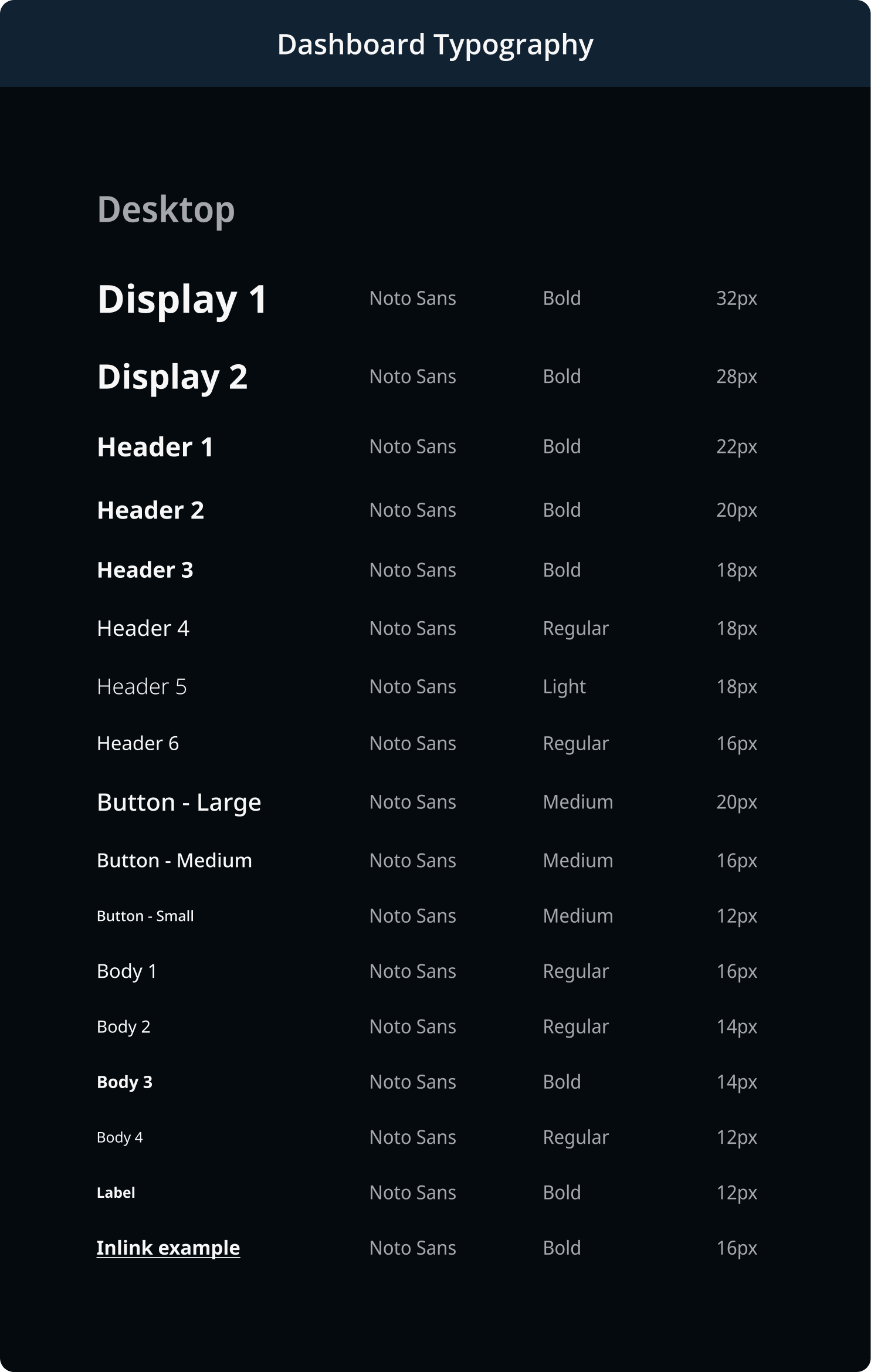
At the start of the project, I proposed 3 header and body fonts that aligned with ColliMate's forward-thinking, yet credible brand. We selected Maven Pro for headers and Noto Sans for body text. I created responsive text styles and variables for each device, ensuring visual and functional consistency.

Extensive Color Palette

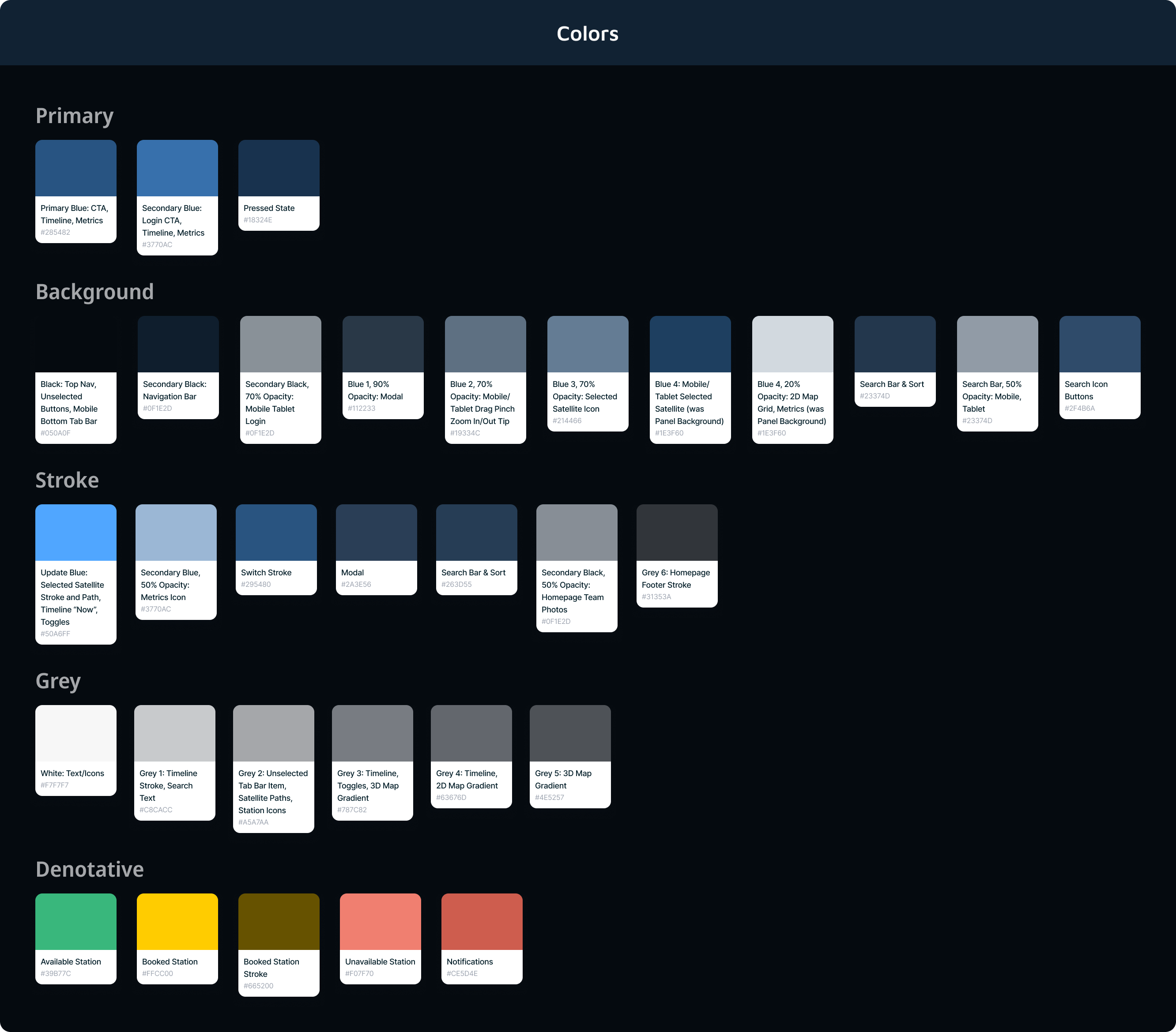
The color palette combines high-contrast tones for accessibility with low-saturated blues, enhancing credibility, usability, and clarity for satellite operators navigating data-intensive environments.

The color palette grew to about 50 colors, including variations in opacity, so one of the most significant challenges was managing this extensive color palette. I diligently led efforts to consolidate color, creating a color reference guide for the team to maintain consistency across the 8 dashboard features. I scheduled one-on-ones with my senior designer to discuss and streamline the palette and held team meetings for alignment. I utilized Figma and Slack for real-time testing and feedback, allowing us to refine elements and create a unified experience. The color reference guides were crucial in enabling our team to iterate with cohesion and clarity, earning me recognition from my senior designer.

Typography
Desktop Typographic Hierarchy
Color Palette
A Portion of the Color Palette

Glassmorphic Color Variations

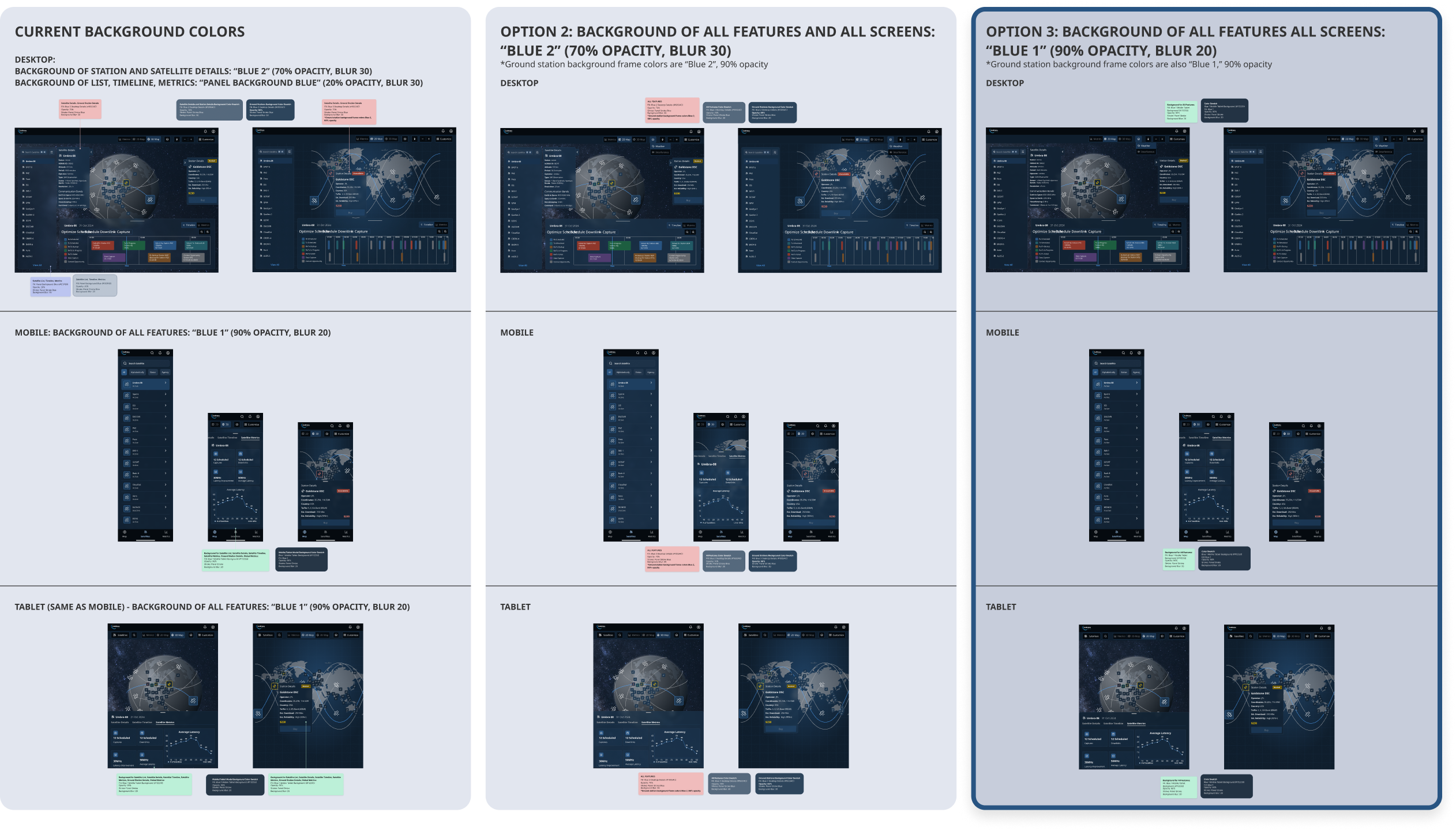
Due to the aesthetic of dark mode and glassmorphism, the look of each feature's background color varied depending on its placement within the screen. To ensure a consistent look, I proposed two slightly different blues for the background colors of the desktop features to my senior designer: one for the inner features and one for the outer features.

Mobile & Tablet Adaptation

Adapting the design system to mobile and tablet presented additional challenges, particularly with dark mode and glassmorphism on smaller screens. Because of the smaller screen sizes, the glassmorphic dashboard features overlap the map, raising accessibility concerns.

To achieve a cohesive, glassmorphic look with the desktop screens, I proposed two slightly different blues with increased opacity for the mobile and tablet feature background color to my senior designer. We proceeded with the darker blue option for higher color contrast.

Key Takeaway

After further discussions, I recognized the difficulties of managing two background colors for the desktop features and a third for mobile and tablet features. We decided to unify the background color across devices to the darker blue used in mobile and tablet (Option 3 in the image below).

This decision required us to sacrifice some of the glassmorphism effect on the desktop screens but reinforced the importance of prioritizing core functionalities over aesthetics.

Satellite Icon
Background Color Analysis

Client Handoff

To prepare for the handoff, I conducted a detailed quality inspection of the final designs. Faced with the challenge of conveying my vision and how users would interact across devices, I focused on clear annotations to explain each element. I created tooltips for less intuitive features, like the compass icon and touchscreen zoom functionality, and included essential views, like station availability, weather and interference layers, and customized 3D and 2D map screens.

ColliMate Client Handoff

Success!

Our efforts led to a successful handoff, reinforcing the value of detailed documentation and collaboration, essential in producing a cohesive, responsive new dashboard for the client that translates user stories into actionable items.

Satellite Icon

Reflection

Lessons Learned

One of my biggest takeaways was the power of cohesive design through consistency in text and color variables and components, especially when collaborating as a large, remote team with varied schedules. I learned the importance and application of giving users freedom and control to customize their view. In hindsight, refining the customization views of the maps earlier would have facilitated additional iterations.

Biggest Challenge

I was excited to explore dark mode and glassmorphism, but adapting the glassmorphism effect to mobile and tablet posed a challenge, compromising accessibility. This was a lesson in function over form and reinforced the need for flexibility when design elements do not scale as envisioned. Considering the bigger picture, using a single background color for features across devices was the best choice for the client, developers, and users, ensuring cohesion and responsiveness. This experience highlighted the importance of prioritizing usability and consistency across devices, an essential takeaway for future projects.

Future Thinking

I faced many exciting challenges due to the complexity of the dashboard, like an extensive color palette. Due to time constraints, I could not reduce the color palette further. In future projects, I aim to regularly review color usage to create a more streamlined workspace and ensure consistency across devices. I will leverage these learnings to optimize workflows, emphasize detailed organization, and foster effective feedback loops.

Final Thoughts

Working in agile methodology enabled me to embrace flexibility during design sprints, rapidly iterate on ideas, incorporate feedback in real time, and adapt the designs to meet changing requirements effectively. My team and I ultimately delivered a user-centered, responsive, and scalable product that will increase investor interest, attract new customers, and boost retention rates.

Wins

  • Leading a remote, sub-team with varied schedules, team members regularly sought my feedback and guidance, which strengthened my leadership skills and was incredibly rewarding.
  • Establishing variables and responsive text and color styles across devices kept the designs unified.
  • As a team, we kept user needs top of mind by allowing users to customize their views with navigation toggles and collapsible modals.
Satellite Icon
home about resume linkedin